29.4Planning Process
Planning is bringing the future into the present so that you can do something about it now.Alan Lakein, author, 1938-
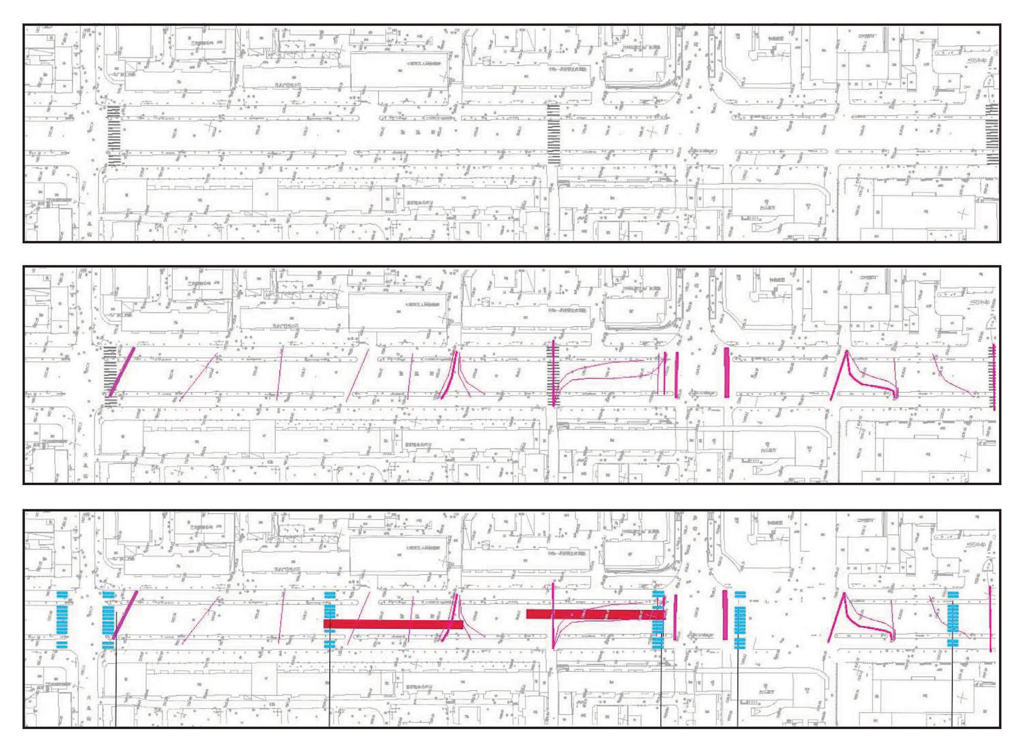
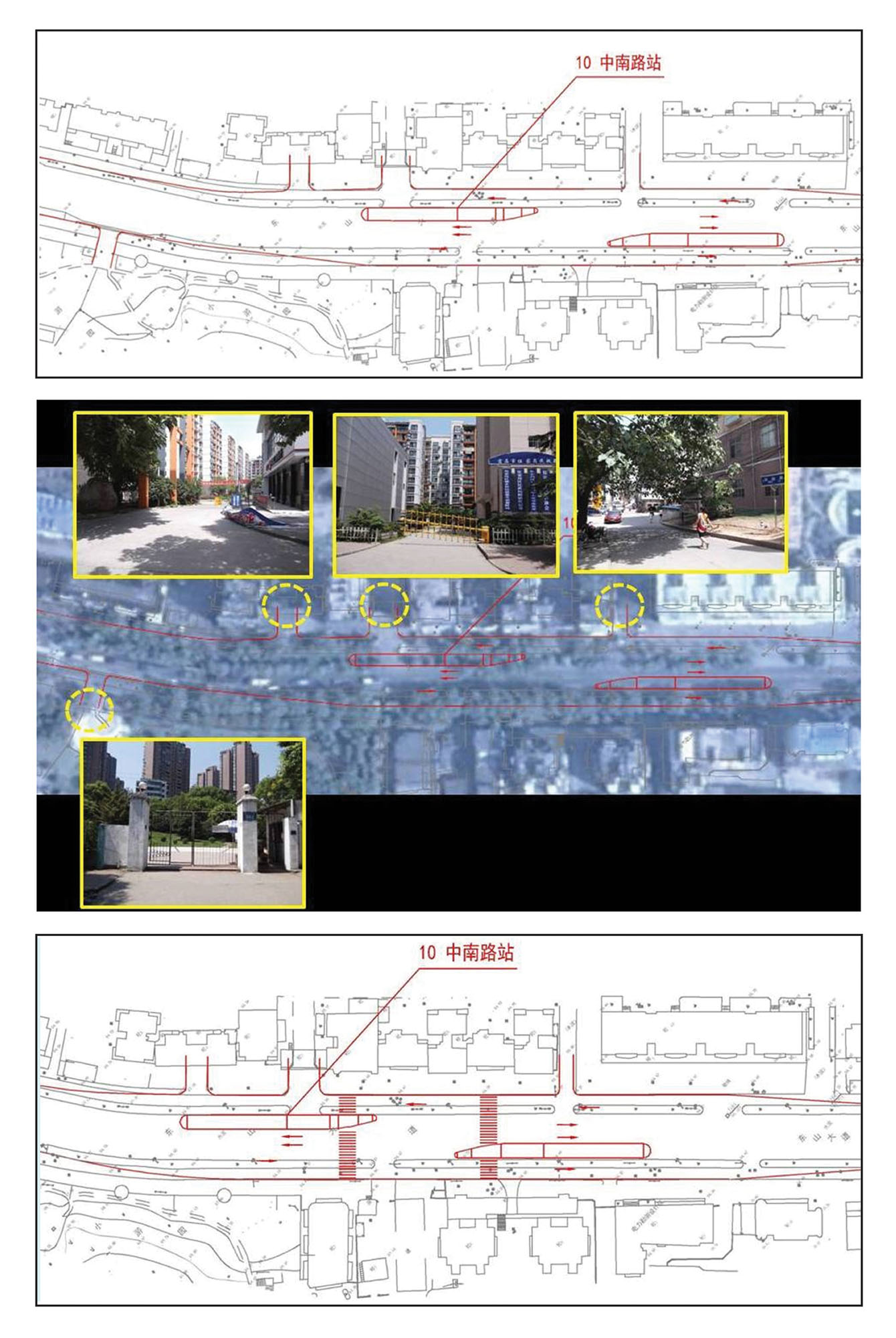
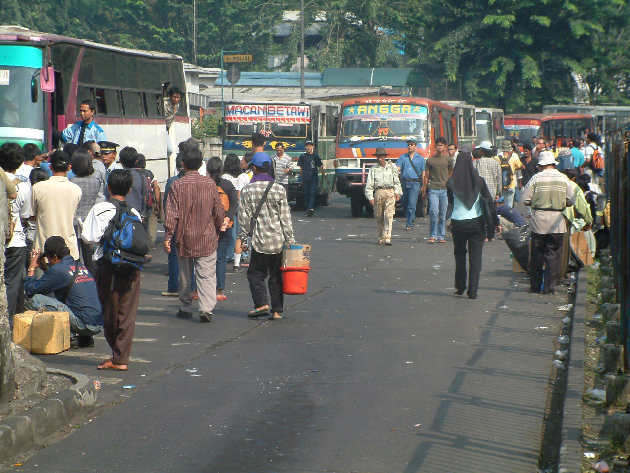
After the general routing and station locations of the BRT are determined, efforts are needed to tie the stations into the existing or proposed pedestrian network. An audit to evaluate the quality of the existing pedestrian infrastructure along these corridors can locate potential problem areas. Other types of surveys can document pedestrian movement patterns. With this information in hand, priority areas for improving pedestrian conditions can be identified and included in the BRT budget.
29.4.1Station Adjustment
Once the station locations have been preliminarily identified, a closer look at the micro-network can take place. This includes existing (or planned) crossing opportunities, desire lines, minor intersections, ideal crosswalk locations, and so forth. The idea is to adjust the station location so that it may enhance pedestrian activity.
29.4.2Pedestrian Infrastructure Audits
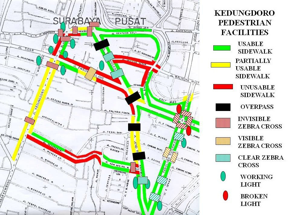
Evaluating the quality of the pedestrian infrastructure in a station area is not complicated. A quick visual scan of the area around the station can usually determine whether good-quality sidewalks exist, whether good-quality crossing facilities have been provided, whether proper lighting exists, and whether pedestrian facilities are free of encroachments.
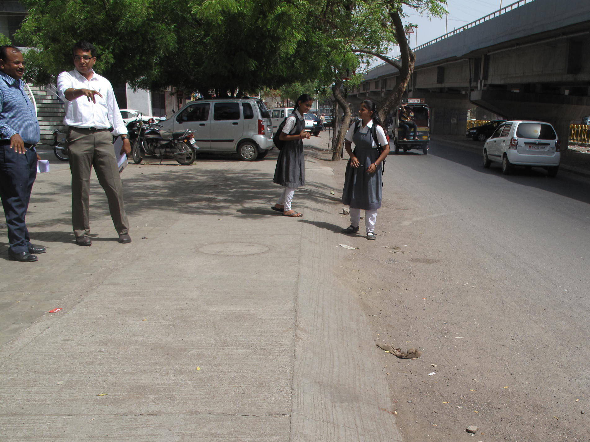
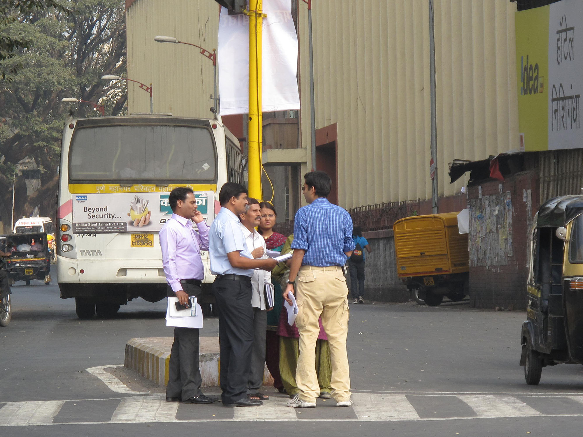
The principal tools for conducting a pedestrian infrastructure audit are a map, a camera, and a device for measuring distances. As the audit team walks along the corridor, the following features are observed:
- Width of the clear space available for walking, noted at periodic intervals;
- Number of obstructions on the sidewalk, both permanent (e.g., building encroachment) and temporary (e.g., a parked car, vending stand, or construction debris);
- Number of pedestrian facilities/elements, such as trees, street vendors, seating, garbage bins, and public toilets;
- Number of pedestrians on walkway, in street, and in plazas.
The last indicator is an overall measure of the success of the surveyed facility at attracting users. If most pedestrians are not using the walkway, this is a clear sign that a design or management issue needs to be resolved. Once this information is collected, street environments can be ranked based on their positive and negative attributes.
The evaluation of the pedestrian environment should be standardized to allow performance measures to be tracked. The United Kingdom’s Transport Research Library developed a standardized review process called the Pedestrian Environment Review System (PERS) that includes the criteria seen in Table 29.2. Tied to software that maps the indicators, it is possible to evaluate walking environments near station areas.
Table 29.2Pedestrian Environment Review System (PERS) criteria
| Pedestrian Route Review | Pedestrian Link Review | Pedestrian Crossing Review |
|---|---|---|
| Directness | Effective width | Crossing provision |
| Permeability | Dropped curbs | Deviation from desire line |
| Road safety | Gradient | Performance |
| Personal security | Obstructions | Capacity |
| Legibility | Permeability | Delay |
| Rest points | Legibility | Legibility |
| Quality of environment | Lighting | Legibility for the sensory impaired |
| Contributing link reviews | Tactile information | Dropped curbs |
| Contributing crossing re-views | Color contrast | Gradient |
| Personal security | Obstructions | |
| Surface quality | Surface quality | |
| User conflict | Maintenance | |
| Quality of environment | ||
| Maintenance |
Source: Reproduced from Reid, Stuart (2003), “Pedestrian Environments: A Systematic Review Process.”
29.4.3Tracking Surveys
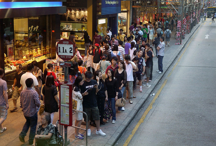
Pedestrian-tracking surveys are a useful way to document how people use a street, intersection, or plaza. Tracking surveys are usually conducted at complex intersections and public transport facilities, particularly if these facilities or intersections have been identified as having a high number of pedestrian injuries and fatalities. Insights from the survey can inform the design of pedestrian improvements. Just as traffic counts are an important input element in the BRT modeling and operational planning process, pedestrian counts and pedestrian movements are needed to understand issues around station access.
The basic technique for tracking pedestrians is to position several surveyors throughout the location. As someone walks past, the surveyor records on a map exactly where he or she walked, crossed the street, turned around, and so on. The surveyors do not actually follow anyone, but observe all movements from a single location. The survey can last 20 to 60 minutes, depending on how long it takes to establish the walking patterns. The survey should be conducted across different periods since usage patterns vary by the time of day. For example, morning and evening flows may be reversed, and an optimum design should accommodate the peak flows in both directions. Rather than rely upon a team of surveyors to catch pedestrian movements as they occur, an alternative methodology is to record a video of an area and review the footage at a later time. Aerial photos also indicate where most pedestrians want to go by capturing the tracks they leave in landscaped areas.
Once the pedestrian flows have been displayed on a composite diagram, the movement patterns can be used to design curb extensions, new sidewalks, and other facilities. The survey should be conducted once again after the public transport station is opened to see if the design worked.
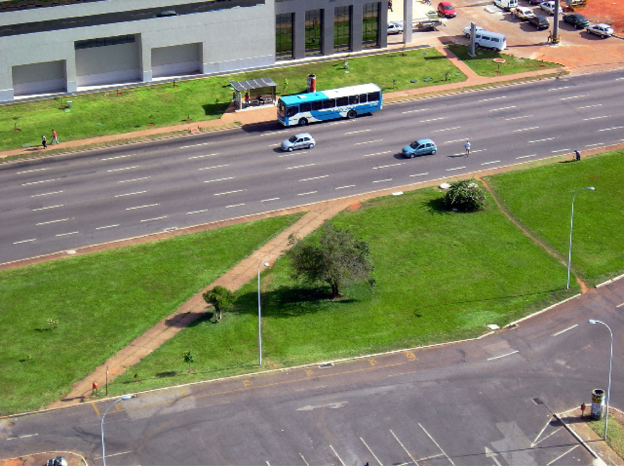
Just as a public transport corridor is designed to handle a particular customer volume, a pedestrian corridor also possesses an inherent capacity. If a walkway is too closely packed, then the desirability of walking is compromised. Crowded conditions cause delay and create the opportunity for crimes such as pickpocketing and sexual harassment. In general, the effective width of a walkway should be 1.5 to 2 meters in low-volume areas, and 3 to 4 meters in commercial areas. In areas that routinely have more foot traffic, a wider walkway is necessary. The formula for calculating such a width is provided below as per Herbie Huff and Robin Liggett’s 2014 The Highway Capacity Manual’s Method for Calculating Bicycle and Pedestrian Levels of Service: The Ultimate White Paper, which pulls the equation from the 2010 Highway Capacity Manual:
\[F_w=1.2276\ \text{ln}(W_v + 0.5W_1 + 50p_{pk} + f_{b}W_{buf} + f_{sw}W_{aA})\]
Where:
- \(F_w =\) width of the crossing;
- \(W_v =\) effective width of the outside through lane, bike lane, and shoulder width;
- \(W_1 =\) effective width of the combined bike lane and shoulder width;
- \(p_{pk} =\) proportion of on-street parking occupied;
- \(f_b =\) buffer area coefficient;
- \(W_{buf} =\) buffer width between roadway and sidewalk;
- \(f_{sw} =\) sidewalk coefficient;
- \(W_{aA} =\) adjusted available sidewalk width.
It is important not to oversize a walkway, lest it be barren.
29.4.4Crash Mapping
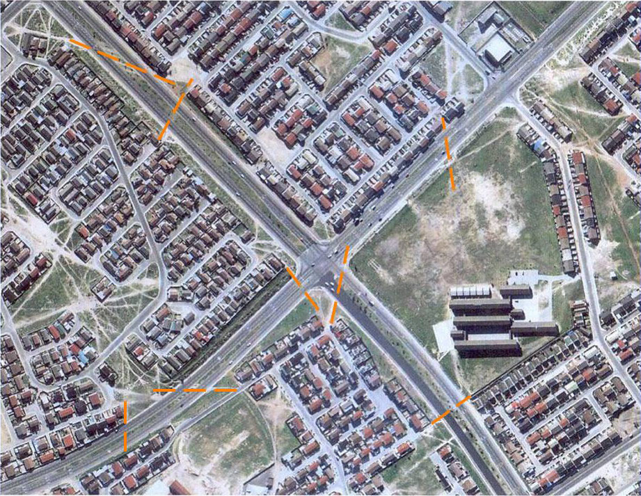
Determining where vehicles hit pedestrians and other vulnerable road users is a fundamental step in safety analysis in general, and for planning a BRT station in particular. Planners should first collect traffic-crash data for incidents involving non-motorized road users from the police and map the locations as precisely as possible. A division between intersection and non-intersection crashes is required. Even though the numbers are likely to be significantly underreported, this simple mapping exercise should make it possible to identify particularly dangerous locations.
Once an especially dangerous location or a future station area has been identified, more detailed analysis should be conducted. Researchers at Lund University in Sweden have developed a “conflict-analysis” technique where a location is observed, and conflicts between various roadway users are recorded. These “conflicts” can include near misses, evasive maneuvers, or simply a reduction in speed. This information complements the crash statistics to help paint a complete picture of safety issues at the location.
Careful analysis of these locations showed that by far the largest number of serious pedestrian crashes and fatalities occurred in the slow lane of the higher-speed section of the BRT corridor, and determined that the primary cause was competition for customers among BRT drivers and other commercial vehicles in the curb lane. The next most dangerous location was high-speed access and egress ramps onto highways. The next most-dangerous location was at poorly lit underpasses where many people were crossing to catch buses and motorcycle taxis going in the opposite direction. Next were crashes in the fast lane, caused by pedestrians crossing the roadway due to the inconvenience of walking to the nearest pedestrian overpass. As is consistent with research from India, but inconsistent from research of higher-income economies, very few crashes were taking place at intersections or roundabouts.
This comparison showed that higher pedestrian volumes are not necessarily accompanied by more deaths and severe injuries. In fact, vehicle speed was the most representative indicator of injury severity. Pedestrian volumes usually mean numerically more people getting hit, but generally with less severe outcomes. This “safety in numbers” argument is borne out by the research.
Table 29.3 shows crash costs as calculated by the United States government in 2010 dollars. The median external cost of a crash is about US$45,000. This includes costs typically absorbed by local governments (police departments, EMS services, property damage). The external and internal cost is about US$160,000. This includes market productivity and household costs. The median quality of life years cost is about US$320,000.
Table 29.3Crash Costs
| CRASH COSTS | Property Damage Only | Minor Injury | Serious Injury | Critical Injury | Fatal Injury |
|---|---|---|---|---|---|
| Medical | US$0 | US$2,999 | US$58,584 | US$418,896 | US$27,840 |
| Emergency Services | US$39 | US$122 | US$464 | US$1,074 | US$1,050 |
| Legal Costs | US$0 | US$189 | US$19,918 | US$100,619 | US$128,694 |
| Property Damage | US$1,870 | US$4,843 | US$8,567 | US$11,902 | US$12,944 |
| Market Productivity | US$0 | US$2,204 | US$90,032 | US$552,768 | US$750,151 |
| Household Productivity | US$59 | US$721 | US$26,555 | US$188,128 | US$241,342 |
| Insurance Administration | US$146 | US$934 | US$23,805 | US$85,928 | US$46,771 |
| Workplace | US$64 | US$318 | US$5,375 | US$10,321 | US$10,965 |
| Travel Delay | US$1,012 | US$97 | US$1,184 | US$11,526 | US$11,526 |
| Market Cost | US$3,190 | US$13,308 | US$234,482 | US$1,381,163 | US$1,231,282 |
Source: L. Blinco, A. Seay, E. Zaloshnja, T. Miller, E. Romano, S. Luchter, R. Spicer. May 2002. The Economic Impact of Motor Vehicle Crashes 2000 (costs in US dollars). National Highway Traffic Safety Administration.
Table 29.3 lists weight factors that can be used to determine the relative safety of a location or area. This list includes direct costs (property damage, emergency medical services, medical treatment, lost productivity, insurance payouts) and indirect costs (insurance premiums, automobile safety features). These multipliers can be applied to existing crash data to show the approximate annual cost of the existing roadway configuration. This list can also be used to estimate potential cost savings of a proposal relative to the cost of construction.
Table 29.4Factors to Determine the Relative Safety of a Location
| Factor | Severity |
|---|---|
| 1,300 | Fatality |
| 90 | Incapacitating injury |
| 18 | Evident injury |
| 10 | Possible injury |
| 1 | Property damage only |
Source: Homburger, W.S., Hall, J.W., Loutzenheiser, R.C. and Reilly, W.R., 1996. Fundamentals of Traffic Engineering. University of California, Berkeley.
Box 29.2 The Limits of Crash Statistics
Vehicle-vehicle incidents and incidents involving fatalities are typically reported with reasonable accuracy, and need not be adjusted. However, research indicates that only 35 to 85 percent of vehicle-bicycle and vehicle-pedestrian incidents involving injury are included in typical crash statistics. A study of California children estimated that police reports only cover 80 percent of hospital admissions (Agran et al., 1990). A British study found that only 67 percent of slight injuries to pedestrians were reported, while 85 percent of serious injuries were (James, 1991). In Germany, the figures are 50 percent for major injuries and 35 percent for minor ones. Based on this research, it is appropriate to adjust vehicle-bicycle and vehicle-pedestrian injury statistics upwards by at least 50 percent (Hautzinger, 1993).
29.4.5Origin-Destination (OD) Studies
By identifying the likely origins and destinations of pedestrians and the most travelled walking routes, planners and designers can prioritize infrastructure improvements in the most effective locations. If the most common walking routes are not inherently clear, it is sometimes helpful to do a localized Origin and Destination (OD) survey of customers disembarking at a BRT station to determine their final destinations. The survey should record all trips, regardless of the mode currently being utilized. If certain OD pairs show a very high proportion of short motorized trips, it may be because the pedestrian facilities are of very poor quality. Often, popular short OD pairs currently dominated by motorized modes can indicate locations where pedestrian improvements might be prioritized. When new pedestrian facilities along the TransJakarta system were opened, taxi drivers in the corridors complained of losing a considerable number of short fares.
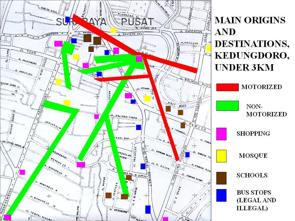
Another type of mapping that can provide useful insights into severance problems is to record travel times from the station. Maps showing areas covered in such intervals as 1 minute, 5 minutes, 10 minutes, 20 minutes, and 30 minutes not only indicate the potential catchment area for the station, but may also highlight potential barriers to pedestrian access. For example, a busy roadway near the station may create severance issues for approaching pedestrians. Other impediments, such as blocked or nonexistent pavements, will become evident in a time-based mapping. Also, long signal cycles for pedestrian crossings will increase walking travel times. This type of analysis can often show areas where distances are relatively short but pedestrian travel times are lengthy.
29.4.6Detour Factors
Detour factors are the distance that the average pedestrian, cyclist, or pedicab operator needs to travel out of their way in order to reach their destination, relative to the straight-line distance. In a typical European or American traffic grid with no restrictions on non-motorized vehicle travel, the detour factors are generally very low. A detour factor of 1.2, as observed in Delft in the Netherlands, is extremely low. This level means that the average cyclist only needs to travel 20 percent farther than a straight-line distance in order to reach the destination. Unsafe, high-speed roads can create severance problems by restrictions on non-motorized vehicles on specific streets, by barriers to crossing streets, by a one-way street system, a lack of a secondary and tertiary road network, and by large canals, railroad tracks, and other impassable infrastructure.
It is fairly typical in lower-income countries for distances between intersections to be 1 kilometer or greater. Normally pedestrians are able to cross reasonably safely at grade at intersections, but sometimes traffic planners even discourage at-grade crossings at intersections in order to allow free left- or right-hand turns without any pedestrian conflicts. Traffic planners also like to erect barricades that try to force pedestrians to cross major roads only at designated pedestrian overpasses, and frequently, these overpasses are as much as a kilometer apart. In these typical conditions, if a pedestrian simply wants to cross a 50-meter wide street, and the nearest overpass is 225 meters away, the pedestrian will have to walk 500 meters to go a straight-line distance of 50 meters. This distance represents a detour factor of 1:10. At a moderate walking speed of 1 meter per second, this represents a 7.5-minute detour. This situation is a reason why pedestrians frequently refuse to use pedestrian overpasses.
Pedestrian connectivity to a BRT station is also a function of the layout of area roads and paths, with and without pedestrian infrastructure. It is fairly typical in lower-income economies for the secondary street system to be extremely weak. Residential areas often connect to major arterials only at a very limited number of access points, and these local streets rarely connect to other residential areas except via the major arterials. Street networks that rely on a high number of minor roads that do not connect with each other severely limit the pedestrian’s ability to reach the BRT station. This pattern reduces the functionality of the BRT station, since it requires longer trips to reach destinations. Conversely, networks developed on an interconnected grid system provide greater accessibility, because streets are more connected, which allows pedestrians to travel directly to BRT stations. A grid street system also tends to be more resilient, because the system will not fail if one link is blocked. It is sometimes possible to find locations for small pedestrian shortcuts to reduce high detour factors caused by the lack of a secondary street system.