6.7Deciding on Stop Elimination and Express Services
If you want a happy ending that depends, of course, on where you stop your story.Orson Welles, actor, director, producer, and writer, 1915–1985
This section addresses the question of whether a new BRT service should retain the same stations as preexisting services, and whether limited-stop services should be created. Creating limited-stop services is done by means of selecting a proportion of the trips on an existing service and changing the programming to skip stops at certain stations: the unchanged service will be referred as the local service and the other one or more as a limited-stop service (or express service).
While eliminating stops from the system increases the walking time required by some customers to reach a stop, it also increases the average BRT vehicle speed (or “commercial speed”) by removing the fixed dwell times at the station. Fixed dwell time (T0 or dead time) is the time associated with the bus pulling up to the station, docking, opening and closing its doors, and pulling out of the station.
In this chapter, the impact of stop removal on variable dwell time is not considered, as it is assumed there will not be much change with the elimination of stops, as the ridership will just redistribute among the remaining stations.
Including limited-stop service or services has a variety of impacts. The main advantages of limited-stop and express services are:
- Fixed dwell time is eliminated on the express routes so customers whose origins and destinations lie on the limited-stop route will benefit. This is discussed in this section;
- On high-demand corridors, by dividing a route into local and limited stop, the frequency per route is reduced, but also the irregularity of arrivals. This is also treated in this section;
- By increasing overall system speed, overall system capacity can be increased. This is covered in Chapter 7: Capacity and Speed.
However, these services also introduce some costs:
- Customer waiting times on local routes increase, as the frequency on the original route is reduced;
- Vehicles must be able to pass one another at stations.
Adding additional services must balance the benefits of removing fixed dwell time with the costs of adding customer waiting time, and the costs of deteriorated mixed traffic level of service resulting from the need to introduce passing lanes at all stations skipped by limited-stop services.
This section provides guidance to service planners to make decisions about which stations to eliminate or add when introducing a BRT system. The first subsection provides a basic methodology for deciding when to eliminate a station. It is a simple cost-benefit equation that compares the additional walking time to the reduction in fixed dwell time and provides some simple rules of thumb.
The remainder of the section assumes that the local service will be retained, but that additional limited-stop services will be created. In all these examples, walking time is no longer an issue, as the local service is retained, but at a lower frequency. Rather, it is an issue of balancing the waiting time associated with reduced frequencies per route and with the increased bus speeds. It is also a matter of optimizing frequencies to reduce the irregularity of service.
Normally, service planners will look at the demand profile of the corridor (an internal O/D to the system that also provides the number of customers on board at each link), and using a simulation model, will run alternative scenarios to test its benefits and its costs (operation and travel times). Service planners generally do not try an infinite number of possible alternatives; they use certain basic approaches to determine which scenarios are likely to perform the best, and limit themselves to a reasonable number of scenarios. This chapter is aimed at making more transparent the basic thinking that service planners use when defining scenarios to test using their simulation models.
6.7.1Station Spacing and Station Elimination
When deciding whether to eliminate or add stations, it is necessary to determine what constitutes optimal spacing. If stations are spaced very far apart in the manner of a metro system, it is possible to reach very high vehicle speeds and system capacities. However, the disadvantage of such an approach is the additional time customers must spend to reach the nearest station. Therefore, BRT station spacing should try to strike an optimal balance between convenience for walking trips to popular destinations, and convenience for customers in the form of higher speed and capacity.
If the origins of customer trips are randomly distributed along a BRT corridor, a standard optimal distance between stations can be calculated. In most contexts, it ends up being between 450 meters and 500 meters, or roughly a quarter mile.
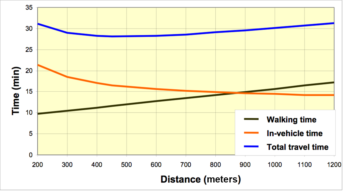
In Figure 6.59 the optimum station spacing distance is where the total travel time (blue line) is minimized. From the figure, this point occurs in the range of a station separation of 400 meters to 500 meters.
The following formulas can be used to calculate the optimal distance between stations, where the total walking cost and travel cost is minimized, or where:
Eq. 6.49
\[ \text{Distance}_\text{optimum} = MIN({C_\text{walk} + C_\text{travel}}) \]
Where:
- \( \text{Distance}_\text{optimum} \): Optimal distance between stations;
- \( C_\text{walk}:\) Walking cost;
- \( C_\text{travel}:\) Travel cost.
Table 6.30 provides an example comparing general travel times for varying station spacings (from 210 meters to 500 meters) for an average customer trip. In this example, the average customer trip on a corridor is 4.35 kilometers. The trade-off between additional walking distances due to fewer stations and time spent waiting at stations due to more stations is compared on a per customer basis.
Table 6.30Comparison of General Travel Times for Varying Station Spacings
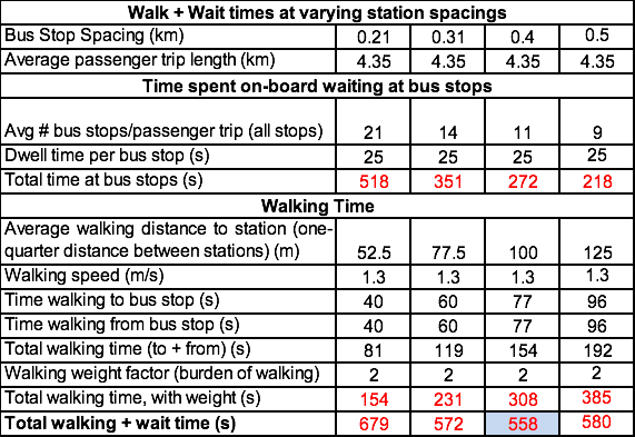
In Table 6.30, the average number of stations per customer trip on the corridor is derived by dividing the average trip length by the average distance between stations. This is then multiplied by the average fixed dwell time per station to get the average delay per customer from the selected station distance.
It is then assumed that each customer walks on average one-quarter of the distance between stations at a walking speed of 1.3 meters per second. Boarding customers then have to walk to the station, and alighting customers have to walk from the station. This combined walking time then should be weighted by a factor of two, because most people dislike walking more than they dislike sitting on a moving bus. When these are compared for different stopping distances, the minimum total cost of walking and transiting customers occurs at an optimal distance of around .4 or .45 kilometers between stations. This turns out to be the optimal spacing when demand along a corridor is relatively uniform.
The BRT Standard gives 2 points for a system where the average stopping distance between stations is 0.3 kilometers and 0.8 kilometers (or between 0.2 miles and 0.5 miles), with 450 being a typical appropriate distance between stations. Note, however, that in high-capacity systems with large stations, BRT stations may cover an area around 100–250 meters long, and in this case a more reasonable station spacing is around 600 meters.
Of course, this calculation has been made per customer, rather than for customers in aggregate. Where there are large volumes of boarding and alighting customers, more frequent stations will be optimal, because more people will be affected by the long walking times than will benefit from the faster vehicle speeds. In areas with very few boarding and alighting customers, greater distances between stations will be optimal, because fewer people will benefit from the shorter walking distances, and more will benefit from the faster vehicle speeds. For this reason, it is fairly typical to have stations spaced at a greater distance apart farther from the city center, where demand is lower, and closer together downtown, where both demand and the density of trip attractors or generators are higher. Figure 6.59 visually summarizes the trade-off between walking times and BRT travel times in relation to the distance between stations.
Further, the optimal distance is not a constant, but will vary depending on a number of factors, including: the average trip length (assumed to be 4.35 kilometers in the table above), the average walking speed (used 1.2 m/s as a design speed to accommodate the range of walking speeds, but this can vary from city to city), the weight that people attribute to walking and urban density. In the table above, a weight of two was used, but if, for example, a lot of people are elderly or disabled, or if the walking environment is very bad, people might pay more to avoid walking.
A reasonable average stopping distance is around 450 meters for low-capacity stations and 600 meters for larger, high-capacity stations. This spacing is the best way to minimize walking distances, while keeping vehicle speeds at a reasonable level. BRT stations are typically located near major destinations such as commercial centers, large office or residential buildings, educational institutions, major junctions, or any concentration of trip origins and destinations. Usually this siting is done based on intuitive local knowledge and space availability. The station area will typically consume more right-of-way than other parts of the BRT infrastructure. As such, station location may look for places where the right-of-way can be most easily widened; mid-block rather than at intersections where road space is at a premium; locations where small parcels of public land, variances in the road right-of-way, or the presence of low-cost land such as surface parking lots adjacent to the corridor.
Reducing the number of stations does not reduce variable dwell time, as in most cases the vast majority of boarding and alighting delay will just redistribute to other stations if a station is eliminated.
6.7.2Implementing Limited-Stop Services
As discussed in the previous subsection, every station adds delay to customers on board, a BRT vehicle usually needs from 12 to 30 seconds of dead time per station, and an average can be readily calculated for a specific corridor by observation. The idea of introducing limited and express services into a BRT system is to reduce this fixed dwell time.
The introduction of a new, limited-stop service usually implies reducing frequencies on the local service. While the new limited-stop service will travel at a higher speed, the demand on the corridor is now divided between the local route or routes and the new limited route. The frequency of the original route therefore goes down, and the drop in frequency introduces some additional delay to local route customers making trips not served by the express route, as they have to wait longer for their vehicle to arrive.
Generally, routes should have a frequency of at least 10 vehicles per hour. If adding a limited route drops the frequency of the local service below 10 vehicles per hour, the chances are that the longer waiting time faced by the customers who cannot take the limited as an alternative will outweigh the time savings for those who can take the limited. There are, of course, exceptions.
This reduced frequency may also have an extra benefit in some cases because too high service frequencies commonly lead to service irregularity. Consider, for example, a vehicle that is a minute behind schedule in a service with 5-minute headways (12 vehicles per hour) service: when it arrives at the station the number of customers waiting to board is 20 percent larger than expected by the schedule, so it will need a bit more time for boarding and will be a bit more delayed. The next vehicle arriving at the same station (also on the schedule) will have 20 percent fewer boarding customers and will leave a bit sooner. The vehicle in front will increase the number of alighting customers per station as well. As the two vehicles continue down the route, the vehicle in front will fall farther and farther behind until the two vehicles are running together. If frequency is higher than 30 vehicles an hour (2-minute headway), the chances that one vehicle will arrive at its destination crowded and late, and the vehicle directly behind it will arrive nearly empty rises sharply. This irregularity leads to vehicle queue delays at stations (see Eq. 6.22).
Therefore, if there are more than 30 vehicles an hour, there will be time savings from splitting the demand into more than one service, a local and a limited-stop service, just as a way of reducing the station queueing delay associated with this irregularity. Empirical evidence indicates that 22 vehicles an hour is optimal from the perspective of improving service regularity.
As a baseline, then, routes with frequencies of 20 or more per hour are candidates for the introduction of limited-stop services. If it is assumed that a standard 12-meter vehicle is at a reasonable design capacity at 60 customers per vehicle, 20 vehicles per hour translates roughly into a maximum load of 1,200 customers per hour. Limited-stop services can therefore be considered for services that have maximum load above 1,200 customers per hour, as follows:
- At loads of 1,200–1,800: It may make sense to introduce a service that only stops at the more popular stops when most boarding and alighting demand is concentrated at only a few stops along the corridor, but where the simple elimination of the stop is difficult for political reasons.
- At loads greater than 1,800: If demand is relatively evenly distributed along a corridor, it is desirable to split this demand up into more specialized services, as it will not add much waiting time (due to high frequencies related to the demand), and will increase speed for many customers, while also improving comfort and regularity of service.
- If trip lengths are long, or the renovation rate is low, these may indicate the need for limited-stop or express services.
Beyond these basic principles, more detailed analysis should be done to determine whether limited-stop services are needed and where they should stop. To make a more detailed determination, something needs to be known of the trip origins and destinations of the customers using each bus route. Normally this is done by gathering enough information to put a corridor-specific OD matrix into a simulation model, and then running alternative scenarios to see how they perform. The following sections provide some basic guidance as to the sorts of local and limited-stop service patterns that one might test and why. Once he demand patterns of the alternaive services are output from the model, the following provides some tools to make a determination on the best pattern using cost-benefit analysis.
6.7.2.1The Costs of Implementing Limited-Stop Services
The primary downside of implementing a limited-stop service is that it divides the ridership between the two services, cutting the frequency of the original local service, and hence increasing waiting times for the local service. Therefore, in order to determine whether it makes sense to add a limited-stop service, one must begin by calculating the total cost associated with waiting for a bus on a local route, as this will be the main cost of adding a limited route. In the sections that follow, the benefits will be calculated.
The cost of implementing an express route results in:
Eq. 6.50
\[ \text{ExpressCost} = \text{WaitCost}_\text{express} + \text{WaitCost}_\text{local} - \text{WaitCost}_\text{original service} \]
Where:
- \( \text{ExpressCost} \): Additional cost of waiting during the peak hour with express service implementation;
- \( \text{WaitCost}_\text{original service} \):Total waiting cost of the original service;
- \( \text{WaitCost}_\text{express} \): Total waiting cost of the included express service;
- \( \text{WaitCost}_\text{local} \): Total waiting cost of the new local service.
The cost of waiting for a route (original, new express, or new local) service (WaitCostrouteexpress) is calculated using the previously explained formula from Section 6.4.3 Equation 6.12:
\[ \text{WaitCost}_\text{route} = \text{Ren}_\text{route} * \text{Cost}_\text{wait} * 0.5 * (1+ Irr_\text{route}) *\text{LoadFactor} * \text{VSize} \]
Where:
- \(\text{WaitCostRoute}\): Total waiting time cost generated to the route users (in $);
- \(\text{Ren}_\text{route}\): Renovation factor of the route;
- \( \text{Costwait}\): Average user waiting cost ($/time);
- \( \text{Irr}\text{route}\): Irregularity index of the route; measure of the variance between the actual headways and the scheduled headways (usually near 0.3, see Section 6.3.9);
- \( \text{V}_\text{Size}\): Vehicle capacity;
- \( \text{LoadFactor}\): Design load factor (usually 0.85).
Note that frequency itself does not factor into this equation as the cost of waiting does not change based on how long customers must wait. The more demand, the greater number of people waiting, but the higher the frequency, the shorter wait per person; as a result, the total cost of the wait is the same either way. For low demand, each person faces a longer wait but the wait affects fewer people, so in the end, total demand is not related to total waiting cost.
If a BRT service is unlikely to have a functional operational control system, or if a regular bus service cannot easily be measured, it is often sufficient to simply use a standard operational irregularity index, which is usually around 0.3 based on empirical observation, or:
\[ \text{WaitCost}_\text{route} = \text{Ren}_\text{route} * \text{Cost}_\text{wait} * 0.5 * (1+0.3) *\text{LoadFactor} * \text{VSize} \]
However, the level of irregularity usually varies with the frequency, and that will have a significant impact on irregularity. In order to evaluate irregularity varying with frequency (Freqroute), the formula needs to be modified to the following:
Eq. 6.51
\[ \text{WaitCost}_\text{route} = \text{Ren}_\text{route} * \text{Cost}_\text{wait} * 0.5 * (1+ ({\text{Freq}_\text{route} \over \text{Freq}_\text{optimum} }) ^2) *\text{LoadFactor} * \text{VSize} \]
Where:
- \(\text{WaitCostRoute}\): Total waiting time cost generated to the route users (in $);
- \(\text{Ren}_\text{route}\): Renovation factor of the route;
- \( \text{Costwait}\): Average user waiting cost ($/time);
- \( \text{Irr}\text{route}\): Irregularity index of the route; measure of the variance between the actual headways and the scheduled headways (usually near 0.3, see Section 6.3.9);
- \( \text{Freq}_{route}\): Frequency of the route (vehicles/time)
- \( \text{V}_\text{Size}\): Vehicle capacity;
- \( \text{LoadFactor}\): Design load factor (usually 0.85);
- \( \text{Freq}_{optimum}\): Optimum frequency to avoid irregularity of boarding and alighting;
Therefore, the formula can simply be rewritten as:
\[ \text{WaitCost}_\text{route} = \text{Ren}_\text{route} * \text{Cost}_\text{wait} * 0.5 * (1+ ({\text{Freq}_\text{route} \over 22 }) ^2) *\text{LoadFactor} * \text{VSize} \]
For example, if a route is split in two, one local and the other limited, and if half of the original frequency is assigned to each new route, the results for each route become:
\( \text{WaitCost}_\text{express} = \text{WaitCost}_\text{local} \) \( = Re_\text{original service} *\text{Cost}_\text{wait} * 0.5 * (1+ ({\text{Freq}_\text{original service} \over 22 }) ^2) *\text{LoadFactor} * \text{VSize} \)
If we call \( K = Ren_\text{original service}*\text{Cost}_\text{wait} * 0.5 * \text{LoadFactor} * \text{VSize} \) , Eq. 6.42 can be rewritten as:
\[ \text{ExpressCost} = \text{WaitCost}_\text{express} + \text{WaitCost}_\text{local} - \text{WaitCost}_\text{originalservice} \]
\[ \text{ExpressCost} = 2 * \text{WaitCost}_\text{local} - \text{WaitCost}_\text{originalservice} \]
\[ \text{ExpressCost} = 2 * K *(1+ ({0.5 * \text{Freq}_\text{original service} \over 22 }) ^2) - K * (1+ ({0.5 * \text{Freq}_\text{original service} \over 22 }) ^2) \]
\[ \text{ExpressCost} = K *(2+2*({0.5 * \text{Freq}_\text{original service} \over 22 }) ^2 - 1 - ({\text{Freq}_\text{original service} \over 22 }) ^2) \]
\[ \text{ExpressCost} = K *(1+2*0.25*({ \text{Freq}_\text{original service} \over 22 }) ^2 - ({\text{Freq}_\text{original service} \over 22 }) ^2) \]
\[ \text{ExpressCost} = K *(1+0.5*({ \text{Freq}_\text{original service} \over 22 }) ^2 - ({\text{Freq}_\text{original service} \over 22 }) ^2) \]
\[ \text{ExpressCost} = K *(1-0.5*({ \text{Freq}_\text{original service} \over 22 }) ^2 ) ^2) \]
The express cost multiplier \( (1-0.5*({ \text{Freq}_\text{original service} \over 22 }) ^2 ) ^2) \) is shown on the graph in Figure 6.60 as is K shown in function of \( {\text{Freq}_\text{original service} \over 22} (22 = \text{Freq}_\text{optimum}) \):
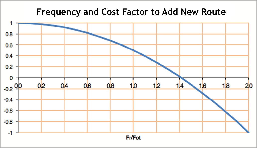
In the graph on Figure 6.60, the “1” on the x axis represents 22 buses per hour (\(22 \over 22\)). The 1.4 represents roughly 31 buses per hour (\(31 \over 22 = 1.4\)). At greater than 31 buses per hour, the additional waiting caused by the reduced frequency from the splitting of the original route for the creation of a new express service is outweighed by the benefit of reducing the irregularity in bus arrivals to the point where CostWait always becomes a negative cost, or in other words, a benefit. Therefore, if a BRT route has more than thirty-one vehicles an hour, it generally makes sense to split it into a new limited-stop service just to reduce irregularity, even if boarding and alighting volumes are nearly uniform between stops.
If multiple (\(n\)) routes are created, then the total wait cost for each new route needs to be calculated:
Eq. 6.52
\[ \text{ExpressCost} = \text{WaitCost}_\text{express(1)} + \ldots + \text{WaitCost}_\text{express(n)} + \text{WaitCost}_\text{local} - \text{WaitCost}_\text{original service}\]
Where:
\( \text{ExpressCost} \): Additional cost of implementing limited-stop services;
\( WaitCost_\text{express(1)} \): Total waiting cost of the first added express service;
\( WaitCost_\text{express(n)} \): Total waiting cost of n-th additional added express service;
\( WaitCost_\text{local} \): Total waiting cost of adding one local service;
\( WaitCost_\text{original service}\): Total waiting cost of the original service.
6.7.2.2Benefits of Implementing Limited-Stop Services
The main advantage of removing stations from a given service is that these vehicles will travel faster. For the most part, the total ridership on the route will simply be divided between the original service and the new limited-stop service, so there will be no significant impact on overall boarding (Tb) and alighting (Ta) time.
Hence, the benefit is a function of the reduction of fixed dwell time (\(T_0\)) for each station removed.
The value of this benefit comes from two things:
- A The reduction in the travel time for all the customers that are using the limited-stop route (\(\text{Load}_\text{limited-stop at k}\)) on each link where a station k is skipped. This should be multiplied by the value of customers’ time (\(C_\text{travel}\)), which is usually treated as half their cost of waiting, or \( C_\text{travel} = Cw/2\). In the above examples, a constant value of waiting of US$12 per hour has been used so that in the examples in this section a constant value of travel time will be $6 per hour. It is usually set at one-third of the average wage.
- B The reduction in the travel time for the BRT vehicles, which would need less time to deliver the same service. The value of the operational cost reduction per bus resulting from the faster bus speeds is equal to the bus operational cost per hour (\(\text{Cost}_\text{bus}\)) multiplied by the number of buses that benefit from the stop reduction (\(F_\text{limited-stop-at-k}\)).
So the benefit of creating a limited-stop service is expressed as follows:
Eq. 6.53
\( ExpressBenefit=T_0* \sum_{k=\text{k=skipped station}} \text{Load}_\text{limited-stop-at-k}*\text{Cost}_\text{travel}+\text{Freq}_\text{limited-stop-at-k}*\text{Cost}_\text{bus} \) Where:
- \( \text{ExpressBenefit} \): Benefit of implementing limited-stop services;
- \( T_0\): Fixed dwell time (or “dead time”);
- \( \text{Load}_\text{limited stop at k}\): Passenger load that uses the new limited-stop route on each link where a station k is skipped;
- \( \text{Cost}_\text{travel}\): Passenger value of time when travelling;
- \( \text{Freq}_\text{limited-stop-at-k}\): Number of buses that benefit from the removal of station, k;
- \( \text{Cost}_\text{bus}\): Bus operational cost per hour (see Section 6.3.12).
An express route should be created when there is a net benefit, or when \(\text{Benefit}_\text{express} \) is greater than the total waiting cost of adding that route, as calculated in the previous subsection item.
Eq. 6.54
\[ \text{ExpressBenefit}>\text{ExpressCost} \]
Where:
- \( \text{ExpressBenefit}: \) Benefit of implementing limited-stop services;
- \( \text{ExpressCost}: \) Total waiting cost of adding route.
For more complex scenarios, the total benefits of each route added need to be weighed against the total costs of each route added.
6.7.2.3Examples of Typical Service Patterns
In the examples that follow, the standard data set in Table 6.31 will not vary by scenario. This data can easily be collected for a planned BRT corridor.
It is assumed that it has already been decided that the optimum number of BRT stations is twenty-five, based on the formula provided in Section 6.7.1, showing an optimal distance between stations. We also assume that the vehicle design capacity has already been decided as a 150-passenger (i.e., VSize * LoadFactor) articulated bus due to the high demand. Then, based on the BRT design and vehicle type, each station is assumed to have a fixed dwell time of thirty seconds, based on data collected from bus operators. The operational cost of this vehicle is US$105 per hour (this is the total bus operating costs needed for the calculation, rather than just the fixed costs). Based on the prevailing wage rate and willingness-to-pay studies, the cost of travel time is US$6 per hour, and waiting is US$12 per hour.
Table 6.31Data Set for Examples of Limited-Stop Services Inclusion
| Description | Variable | Value | Unit |
|---|---|---|---|
| Number of stations | Nstations | 25 | stations |
| Renovation rate | Ren | 1.461 | — |
| Optimal frequency | Freqoptimum | 22 | BRT-vehicles/hour |
| BRT vehicle design capacity | Vsize * LoadFactor | 150 | pax |
| Fixed dwell time | T 0 | 30 | seconds |
| BRT vehicle operational cost | Costbus | 105 | US$/hour |
| Customer travel cost | Costtravel | 6 | US$/hour |
| Customer wait cost | Costwait | 12 | US$/hour |
6.7.3Limited-Stop Services When Demand Is Uniform
Some BRT services have fairly uniform demand, with customers getting on and off a route in more or less even numbers consistently throughout the corridor. Limited-stop services are the least likely to be attractive in the context of homogenous demand, but they are still sometimes attractive, particularly if there is a lot of irregularity resulting from high frequencies. In many instances, limited-stop services are attractive only during peak periods.
When demand is uniform, certain patterns of limited-stop service prove to be mathematically optimal—namely those that skip a cluster of stations.
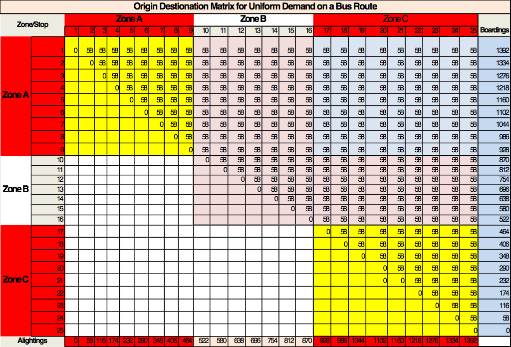
In this example, it is assumed that there is a one-way local bus route, and demand is shaped in a perfect curve throughout the route, as per Table 6.32. In other words, it is assumed that each of the twenty-five station stops is a trip origin (O) and a trip destination (D) in a local origin-destination matrix, and that fifty-eight customers are travelling between each zone.
In a real-world situation, this data should have already been collected and put into a spreadsheet. Most demand modeling software can estimate the OD matrix from boarding and alighting counts, but it is better to have real station-to-station OD data.
Table 6.32Uniform Origin-Destination (OD) Matrix Example
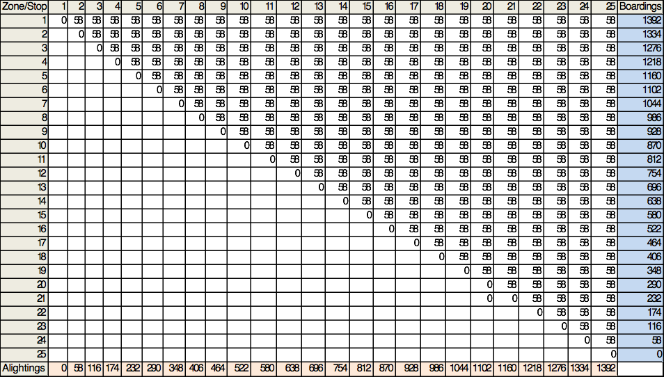
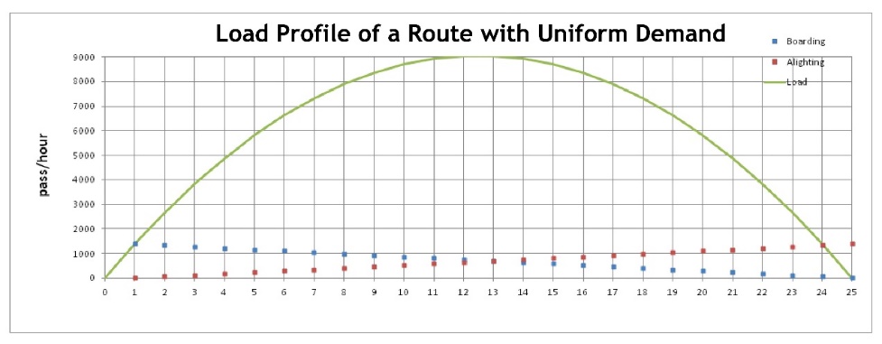
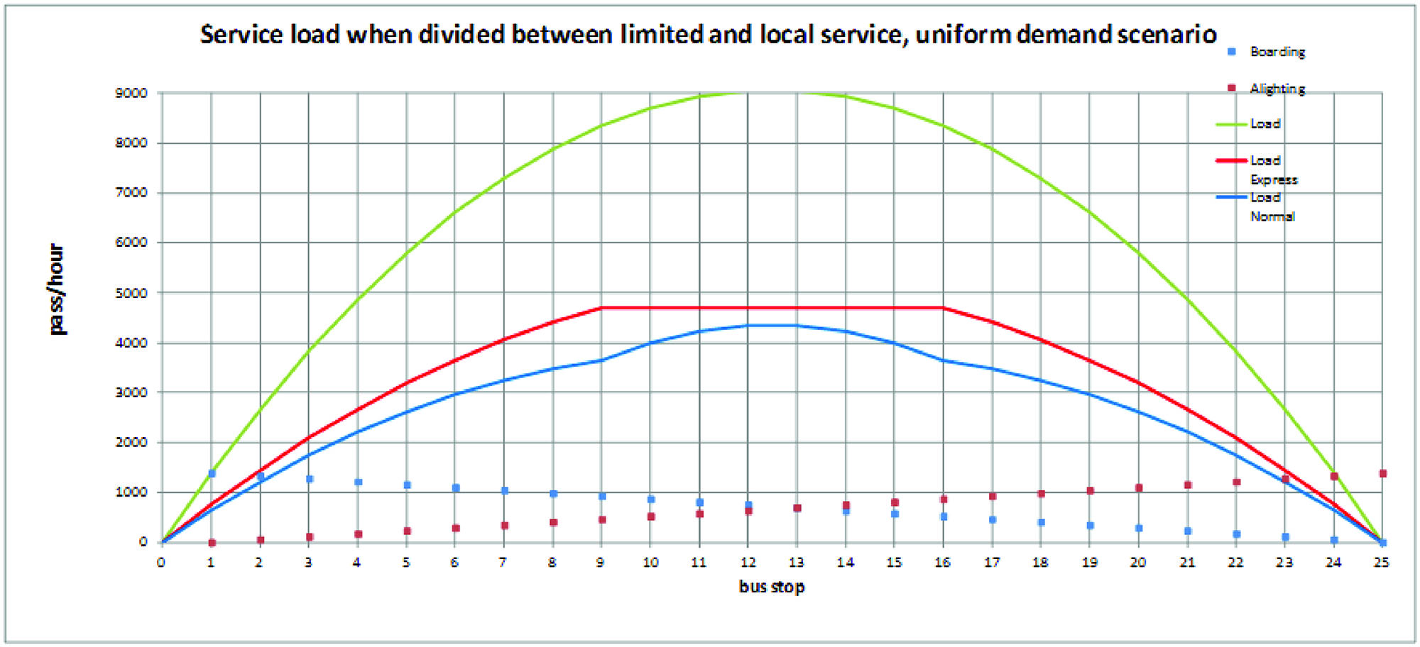
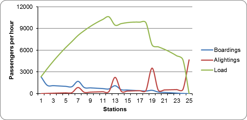
The OD matrix of Table 6.32 would result in the boarding and alighting per station and loads after leaving the station as shown on Table 6.33 and Figure 6.61 where the dots near the x axis show the number of customers boarding (blue) and alighting (red) at each station; the green line indicates the load at each station.
Note that other OD patterns could yield the boarding and alighting results observed in the table, and a different OD matrix will require another optimal service pattern; that is why it is best to have the real OD matrix for the whole operating time or day.
Table 6.33Boarding, Alighting, and Loads per Station
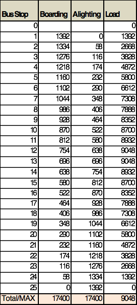
The maximum hourly load on the critical link is 9,048 (MaxLoad). It occurs between the twelfth and thirteenth stations. As the design bus capacity (VSize * LoadFactor) is 150, the frequency (F) should be set at around 61 per hour, or
\[ F = {9048 \over 150} = 61.32 \]
The determination to be made is whether there would be benefits in splitting this demand into a limited-stop service and a local service, and if so, which stations should be skipped by the limited-stop service. There are multiple service patterns that might be tested, but certain standard approaches tend to optimize results. In the case of homogenous demand, a limited-stop service that bypasses the middle stations in the corridor, where the relation of loads to boarding and alighting are higher, proves mathematically to always be superior to other stopping patterns such as skipping stations or clusters of stations at the beginning, middle, and end of a route. As such, no other alternatives are tested under homogenous demand.
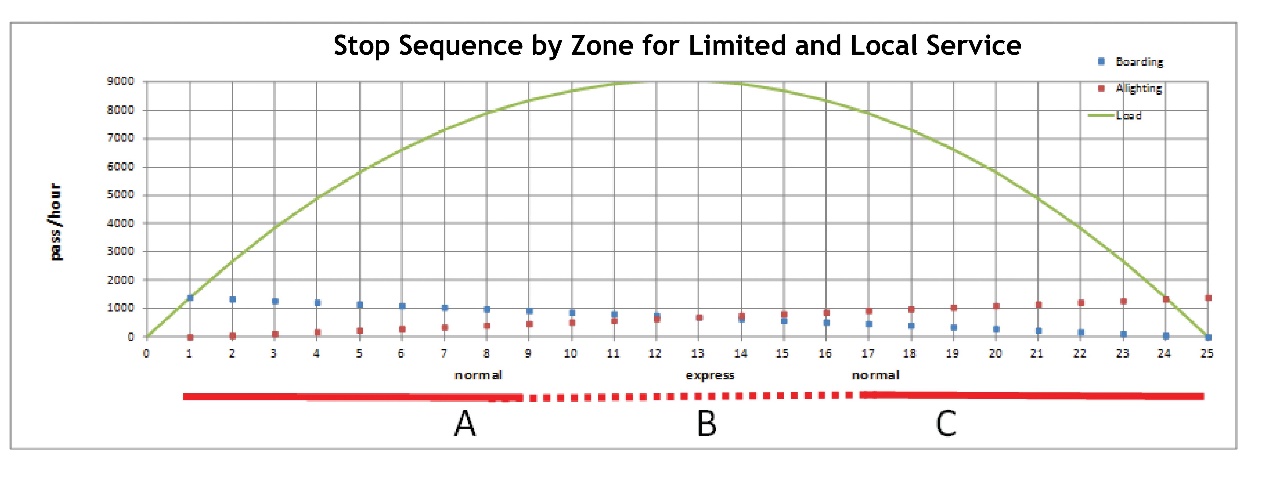
When demand is relatively uniform in a manner similar to this example, it often makes sense to have a limited service run local at the beginning and at the end of its route, and run express in the middle of the route. Figure 6.62 demonstrates this by dividing the route into three zones—A, B, and C. In this case, the limited skips all seven stations in the middle Zone B (stations ten to seventeen).
For a limited service to yield benefits, a sufficient number of customers need to gain enough time from the removal of stations to make up for the loss of frequency that results from splitting the route. To make it worthwhile for customers, the service needs to pass at least a cluster of stations where the total fixed dwell time saved is greater than the new waiting time imposed by the loss of frequency.
From looking at the curve, it may appear that the limited-stop service bypasses the majority of the demand, but keep in mind that the curve says that the majority of the demand is actually on the bus in the middle of the corridor and that boardings and alightings combined are uniform throughout.
Based on the proposed split of the service in two:
- Customers travelling between points within Zone A or between points within Zone C will be indifferent to the two services, and will just take whichever vehicle comes first; there is no cost and no benefit derived from the creation of the new service for those customers;
- Customers travelling between Zone A and Zone B, or between Zone B and Zone C will have to take the local bus, and they will perceive time losses due to the lower frequency on the local service;
- While customers travelling between Zone A and Zone C could take either service, all would take the limited-stop service because, in this example, the time saved from skipping the intermediate stops is greater than the time lost due to waiting for another vehicle. Those who cannot figure out how to read the service maps or confused tourists might be exceptions.
Those taking the limited-stop service gain significant time savings through bypassing stops in Section B from their route.
Table 6.34Demand Division by Zone
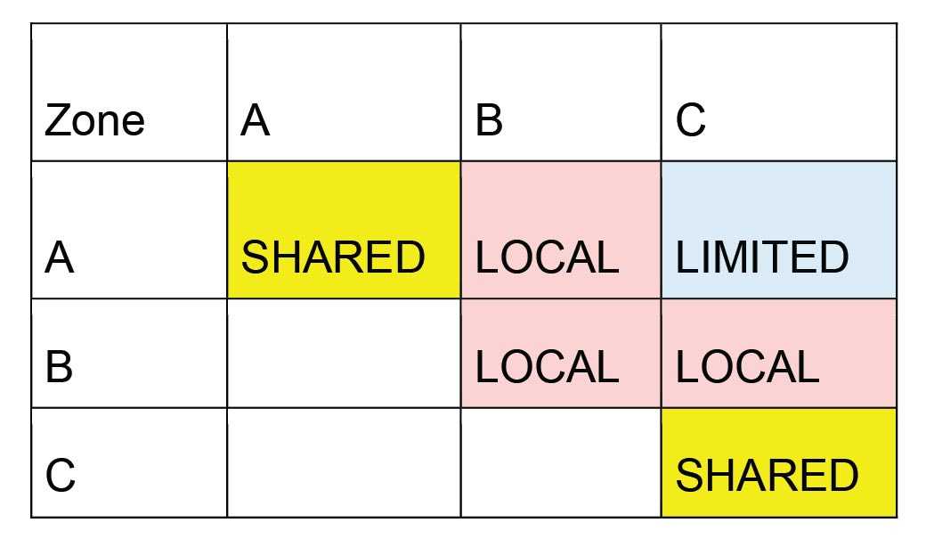
In Table 6.34, the areas highlighted in yellow are trips within Zone A and within Zone C that will be split evenly between the local and express service. The area in pink will be served entirely by the local service, and the area in blue will be served entirely by the express service.
Table 6.35Origin Destination Matrix for Uniform Demand on a Bus Route
Given the demand profile presented here, the load for each service would divide as shown in Figure 6.63.
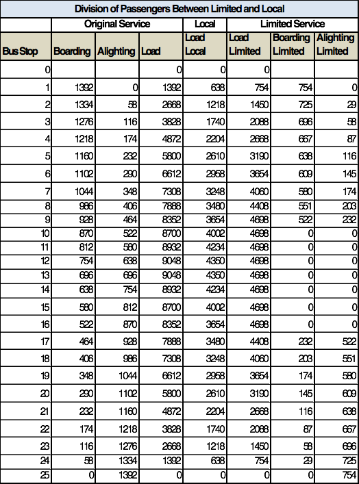
If this division of the demand is assigned on a station-by-station basis to each service, the boarding and alighting numbers for the limited route are given in Table 6.35. The difference between the boarding and alighting numbers on the limited-stop service and on the original route would be the boarding and alighting remaining on the local service (not shown).
Table 6.36Example Division of Customers between Limited-Stop and Local Services
In this case, the benefit is quite simple to estimate, by formula (Equation 6.53):
\[ ExpressBenefit=T_0* \sum_{k=\text{skiped station}} \text{Load}_\text{limited-stop-at-k}*\text{Cost}_\text{travel}+\text{Freq}_\text{limited-stop-at-k}*\text{Cost}_\text{bus} \]
Sum for all stations “k” where the limited does not stop.
The \( \text{Load}_\text{limited stop at k} \) is the number of customers on board the express bus that are passing any station “k” that is jumped by the limited-stop service. In this example, all trips from Zone A to Zone C, which is the area shaded in blue on Table 6.35, or demand from stations (one to nine) to stations (seventeen to twenty-five):
\[ \sum_{k= \text{skipped station}} \text{Load}_\text{limited-stop-at-k} = 9 * 9 * 58 = 4698 \text{pass/h} \]
This is because there are nine by nine zones where there are only express customers and each interzonal demand is 58, so 4,698 customers.
The frequency of the limited and the local route will vary depending on the demand the limited route captures. In this case,
\[ F_\text{express} = {4698 \over 150} = 31.32\text{bus/hour} \]
\[ F_\text{local} = {4350 \over 150} = 28.68\text{bus/hour} \]
Therefore
\[ ExpressBenefit= 30 / 3600 * 7 * (4698 * 6 + 31.32 *105 ) = 1826\text{US\$/hour} \]
Where \( 30 / 3600 * 7 = 30 \) seconds of fixed dwell time per stop removed/3600 seconds in an hour times 7 stops removed; 4,698 is the number of customers; 6 is their value of an hour; 31.32 is the frequency; and 105 is the operating cost per bus per hour.
Recalling that the cost of adding the limited-stop service will be as follows (Equation 6.52):
\[ \text{ExpressCost} = \text{WaitCost}_\text{express(1)} + \ldots + \text{WaitCost}_\text{express(n)} + \text{WaitCost}_\text{local} - \text{WaitCost}_\text{original service}\]
And that (Equation 6.51):
\[ \text{WaitCost}_\text{route} = \text{Ren}_\text{route} * \text{Cost}_\text{wait} * 0.5 * (1+ ({\text{Freq}_\text{route} \over \text{Freq}_\text{optimum} }) ^2) *\text{LoadFactor} * \text{VSize} \]
Given the data set for all examples:
- \( \text{LoadFactor} * \text{VSize} = 150 \)
- \( \text{Ren} = 1.46 \)
- \( \text{Cost}_\text{wait} = 12 \)
- \( \text{Freq}_\text{originalservice} = 60 \)
- \( \text{Freq}_\text{local} = 28.68 \)
- \( \text{Freq}_\text{express} = 31.32 \)
\[ \text{WaitCost}_\text{original service}=0.5*1.461*150*12*(1+(0.5* 60/22)^2 = 3760 \]
\[ \text{WaitCost}_\text{local} = 0.5 * 1.461 * 150 *12 * 1+ (0.5*31.32/22)^2 = 1874 \]
\[ \text{WaitCost}_\text{express} = 0.5 * 1.461 * 150 * 12 * 1 + ( 0.5*31.32/22)^2=1981 \]
\[ \text{ExpressCost} = 1981 + 1874 - 3760 = 95 \text{US\$/hour} \]
So, in this case, \( \text{ExpressBenefit} = 1826 \text{US\$/hour} \) and \( C_{w \text{total}} = 95 \text{US\$/hour}\). In this case, the waiting cost associated with adding another service is very low, because the original service was so frequent that there was a lot of needless waiting due to the irregularity of service, and much of this delay is mitigated by the reduction in frequencies. (Note that the effect of irregularity reduction is a bit exaggerated here, as the portion of users that can take both services will contribute to irregularity of both services in Zones A and C as if it was only one service with a frequency of sixty BRT vehicles per hour.)
Therefore, as \( \text{ExpressBenefit} > \text{ExpressCost} \) it can be said that adding a limited-stop service is a very good idea in this case.
The optimal number of stations to be skipped on the proposed express service is the next determination to make. A rough calculation can be used as a basic guide. In short, the service should make sure that the time saved by the people able to skip stations is greater than the additional time added by the loss of frequency for the people that have to remain on the local service. For example, cutting the frequency from sixty to thirty-one buses per hour implies only an additional minute of waiting. While the average wait is half a minute, one minute is used because the actual average wait time is multiplied by two to factor in people’s perception of the wait time. Thus, the reduction in frequency adds about 1.3 minutes in new delay to customers, if a standard irregularity of 0.3 is used.
With a fixed dwell time at the station stops at thirty seconds, at least three or four stations need to be removed to attract any customers, and probably more. If too many stations are taken away, there will not be enough customers on the new limited to justify a high-frequency limited service, so the range of stations to be removed shall be limited as well.
The following method provides a way of testing whether more or fewer stations should be removed. In essence, the same process run for the specific scenario (seven stations removed) needs to be tested for all other reasonable alternatives.
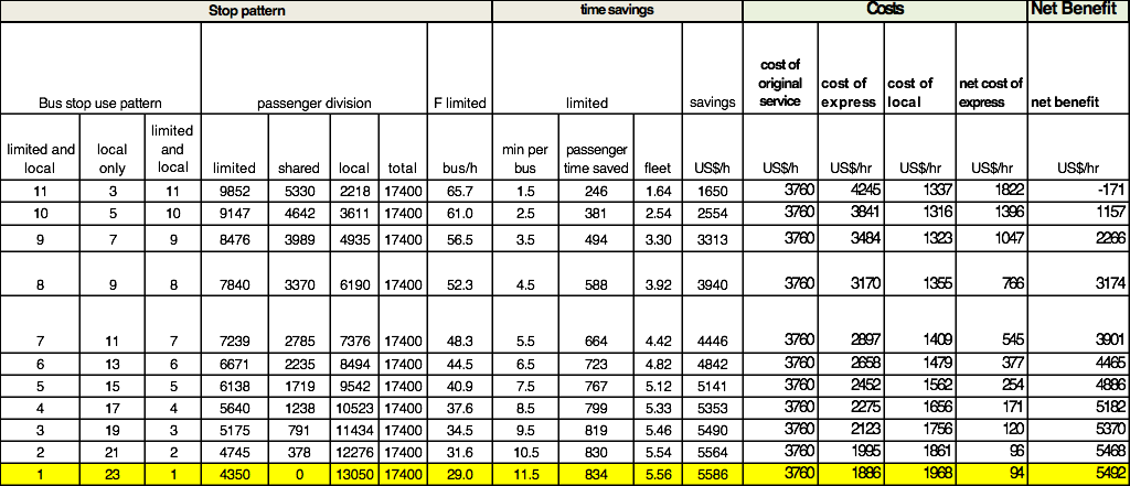
Table 6.37Total Benefits with Varying Numbers of Stops Removed from the Example
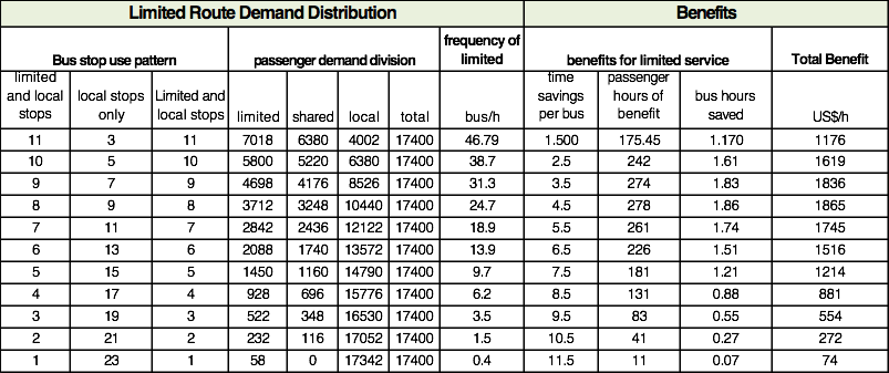
In Table 6.37, the first three columns represent the stopping pattern of various alternative limited services (divided into Segments A, B, and C). The first row represents a scenario where the first eleven stations are both local and limited, the next three stations are local only, and the last eleven stations are both local and limited. The second row represents a scenario in which the first ten stations are shared, then the express service skips five stations, then the last ten stations are again shared, and so on.
The second set of columns (four columns) shows the division of customers between the limited only, the local only, and the customers shared by the two services based on the previously stated assumptions. It is broken out in this way because only the riders interested in taking the express service (going from Zone A to Zone C) enjoy benefits from the removal of stations. The remainder of the limited bus customers (those who take the express and use it as a local within Zone A and Zone C) do not benefit from the removal of stations.
In the third row of the table the initial example is tested. An express service is implemented with seven stops skipped and there are 4,698 customers who benefit from the removal of stations, or those customers moving between Zone A and Zone C.
In addition to showing the required frequency for the limited-stop service, the table also includes calculations of time savings per bus, which is equal to the number of stations skipped by the limited service in Zone B, multiplied by thirty seconds of fixed dwell time saved per station. So for the first row, Zone B stations are equal to three in scenario I, so 1.5 minutes are saved per bus; if five stations are removed, 2.5 minutes are saved per bus, and so forth.
The next column shows the number of customer hours of benefit from the express service. It multiplies the number of express customers that bypass the seven stations (total load of customers passing stations in Zone B) by the savings per bus.
The next column shows the benefits in terms of bus travel time, so it multiplies the frequency of the limited-stop service (46.8 for the first row) by the time savings per bus (1.5 minutes for the first row), then divides the total by 60 to give an hour figure (yields 1.17 hours of bus operating time saved in the scenario of the first row).
Finally, times saved for customers and vehicles are respectively multiplied by the value of time (in the first row: customers’ 175.45 hours saved multiplied by US$6/hour results in US$1,053 and operating cost per bus of US$105/hour times saved 1.17 hours save results in US$123, so the total benefit of the express service [for 3 stops removed] is US$1,176).
These benefits then need to be compared to the net cost of replacing the original service with two new services, one local and one express, as is shown on Table 6.38. These net costs can be deducted from the benefit to indicate total net benefits (last column).
Table 6.38Benefits Net of Costs for Varying Numbers of Eliminated Stops
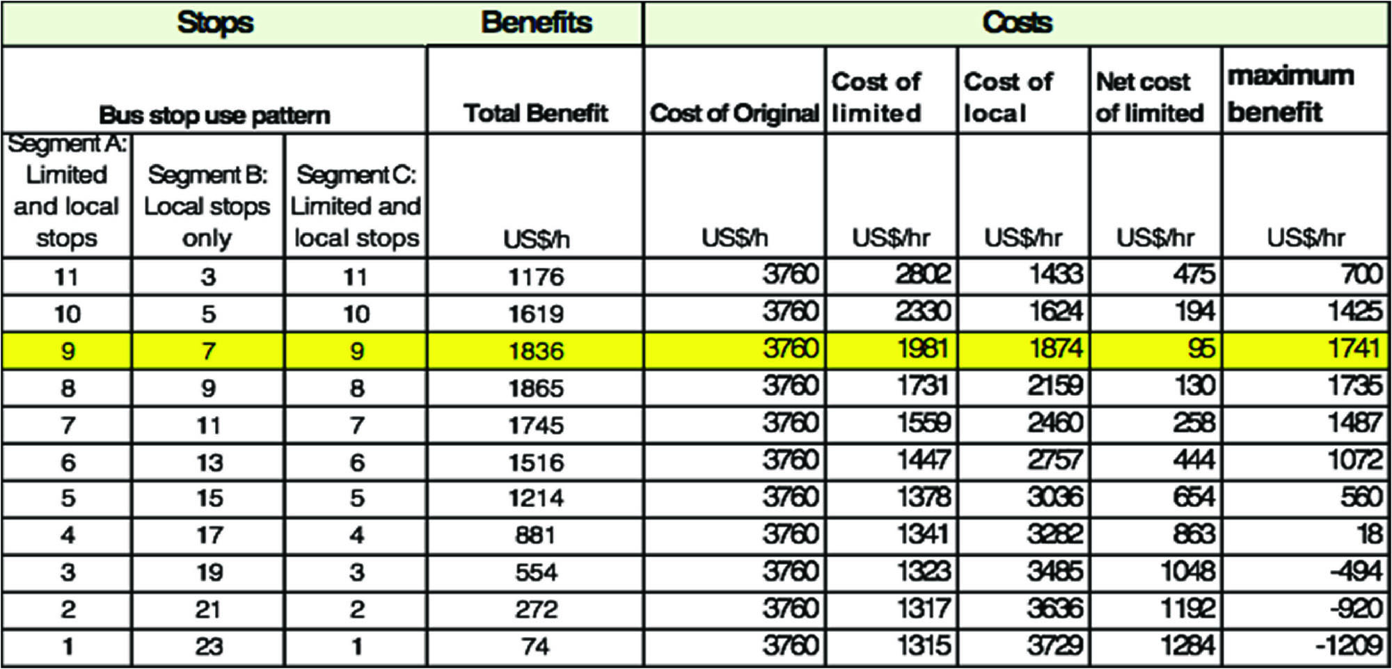
These net benefits are then calculated for all situations proposed, following the method of the original scenario used in this example. The result turns out to favor the initially tested situation: skipping seven stations. The net benefit of skipping seven stations—US$1,741—exceeds the net benefit of every other scenario.
The following table shows the degree of sensitivity of the total benefit to total demand. In Table 6.39, the same attributes are assigned, except the demand is cut by 40 percent across the board. In that situation, instead of the frequency dropping from 60 to 30, with a considerable improvement of irregularity (with 22 being optimal) it drops from 30 to 15 and the irregularity benefit is smaller. Once the time penalty for adding the service is relatively greater and the number of beneficiaries of the new limited service is relatively lower, skipping nine stations becomes slightly more beneficial than skipping seven stations. Hence, in uniform demand, the benefits of the limited service are highly sensitive to demand levels.
Table 6.39Net Benefits of Costs with Varying Numbers of Eliminated Stops under Lower Demand Scenario
6.7.3.1Demand Patterns Typical of Trunk-and-Feeder Systems
In some systems, such as a trunk-and-feeder system, it is likely that demand will be concentrated at the beginning and/or end of the BRT trunk corridor—for instance, at the transfer station on one end and the downtown on the other. Demand will tend to concentrate in this way because the feeder routes on one end would tend to discharge large numbers of customers at the transfer terminal, and there would be a similar concentration of boardings and alightings at the central business district (CBD).
In this example, a total of 17,276 boardings and alightings are assumed, the same number as in the uniform demand example, but in this case, 50 percent of them occur at the first and last stations (25 percent at each) instead of only 8.3 percent.
The boarding and alighting and OD matrix of the corridor, if all other stations have uniform demand, would look like Table 6.40 and, if only one service operated with this OD pattern, the load would look like the load diagram in Figure 6.64.
Table 6.40Origin Destination Matrix for Demand Concentrated at Terminals
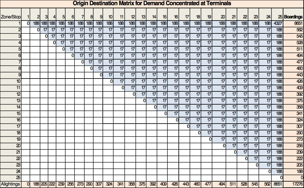
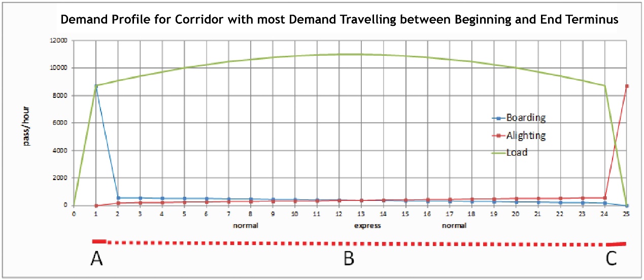
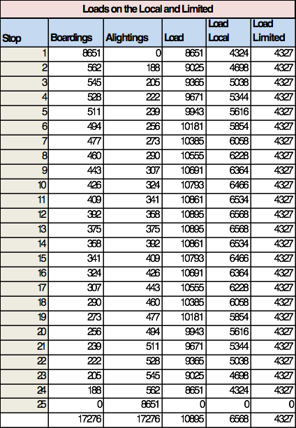
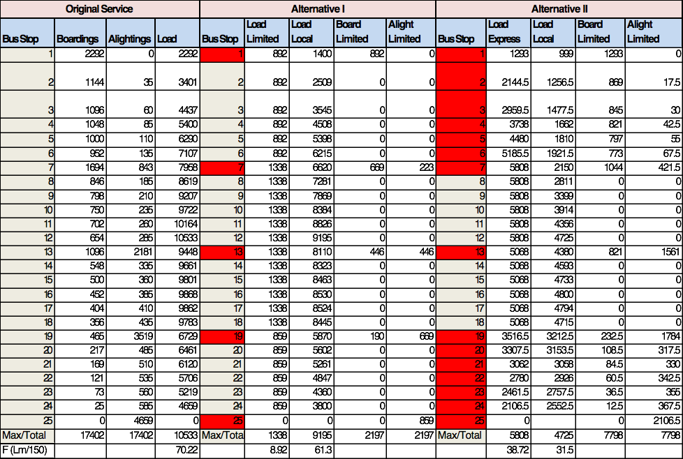
In this case, it is worth considering adding a service that runs directly between the first station (the transfer terminal) and the last terminal (downtown). If such a service were added, the ridership would split between the limited and local service as per Table 6.41.
Table 6.41Loads on the Local and Limited
On Table 6.42, the same stopping pattern is tested for their ridership and comparative costs and benefits, but in each one, an additional station is removed at the beginning and ending of the limited-stop service; the formulas and method from the previous example are used to calculate the net benefit.
Table 6.42Costs and Benefits of Varying Stopping Patterns
In this case, a limited-stop service that stops only at the first and last stations brings more benefits to customers. These benefits significantly outweigh the costs. With a maximum load on the critical link of the limited route at 4,327, and a related frequency of 29 trips per hour (4,327/150), the maximum load remaining on the local service of 6,568 passengers per hour yields a frequency of 44. This is still high enough to cause an elevated level of irregularity in the boarding and alighting process, so another express route might be added. Based on the previous example, this new service would skip the middle stations.
6.7.4Demand Concentrated at a Few Stops
It is also common for demand to be concentrated at a few stops along a corridor because there are some large trip generators or attractors in those locations, like hospitals, schools, high-density housing developments, or shopping malls. Such a corridor might result in a boarding and alighting pattern like Figure 6.65.
The trip origin and destination matrix would look something like that shown in Table 6.43, where the total number of trips is similar to the previous examples.
Table 6.43Origin Destination Matrix Example for Clustered Demand on a Corridor
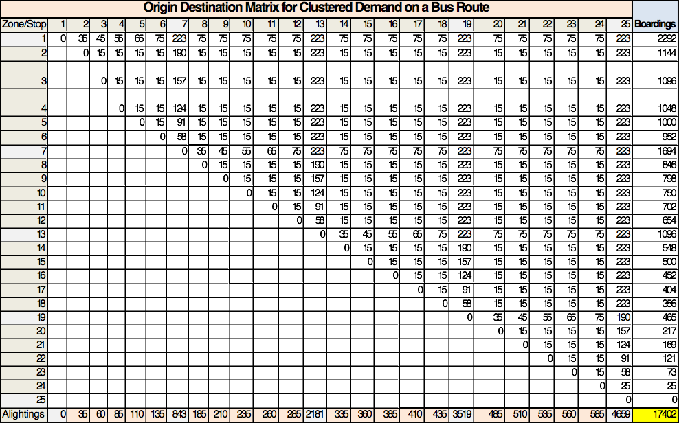
Two options are tested to illustrate some general principles, correspondent boarding, alighting, and loads are shown in Table 6.44 where the stations highlighted in red would be both limited and local stops, while the stations in gray would be served only by the local service.
- One limited-stop service that stops only at the high volume stations, #1, #7, #13, #19, and #25.
- One limited-stop service that stops at #1–7, then #13, then #19–25.
Table 6.44Boardings, Alightings, and Load Comparison between Varying Service Patterns for Clustered Demand Example
The loads assumes that the time savings from the number of stations skipped is greater than the loss of time waiting for the next express bus for all possible express bus trips, so customers between the stations served by the express service (red cells) use that service.
Table 6.45Loads Passing Stations and Benefits for Two Alternative Express Services under Clustered Demand Example
The loads aboard an express service passing the stations skipped for each alternative are listed under the column “Load (k)” in Table 6.45, and the value of the time savings associated with this benefit are calculated in the “Total” column.
Table 6.46Frequency and Operational Vehicle Benefits for Two Alternative Express Services under Clustered Demand Example
In Table 6.46, the required frequency for the new express route is calculated from the maximum load on the express route divided by 150, the designed bus capacity. This is multiplied by the number of stations removed in each scenario and by the operational cost savings per hour to yield the total bus cost savings for each alternative.
Table 6.47 shows the (waiting) costs associated with the lower frequency to be subtracted from the benefits.
Table 6.47Costs of the Two Alternative Express Services under Clustered Demand Example
In the second option of express service, the new express service captures a lot more demand, bringing the frequency of both the express and the local service into a more optimal range, significantly reducing the irregularity of service. The benefit from reduced irregularity is greater than the cost in waiting caused by the reduction in frequency, so in this case the “cost” is negative, or a “benefit.”
As a result, the net benefit of the alternative with express service attending a cluster of stations at the beginning and ending of the route, rather than only stopping at the high-demand stations, performs much better, as shown in Table 6.48.
Table 6.48Net Benefits of the Two Alternative Express Services under Clustered Demand Example
At these high levels of demand, additional express routes can be tried following similarly clustered patterns focusing on higher demand clusters of stations, and their relative costs and benefits tested.
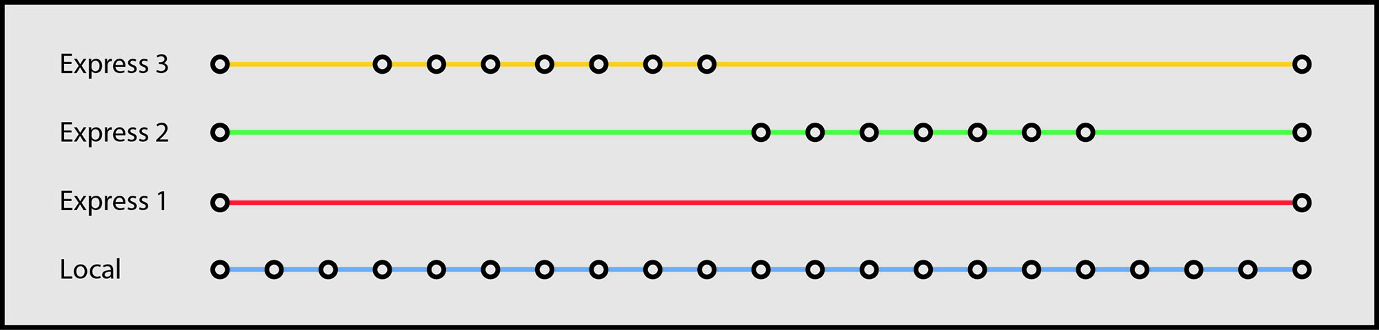
Several clusters of stopping stations should be tested, adding more types of services until the frequency of each route is near the optimal range of twenty-two. The diagram in Figure 6.66 is the original service concept that was developed for TransMilenio in Bogotá loosely based on these principles.
6.7.5Demand Concentrated at One End of a Corridor
There are occasions when there is a very high demand at the beginning of a route and this demand gradually diminishes throughout the route. This situation normally results in the afternoon peak, when there is a monocentric CBD, or when there is a large transfer terminal.
The demand in this case is always decreasing as in Figure 6.67, and the internal O/D matrix with total similar to the previous examples is shown in Table 6.48.
Table 6.49Origin Destination Matrix Example for Declining Demand on a Bus Corridor
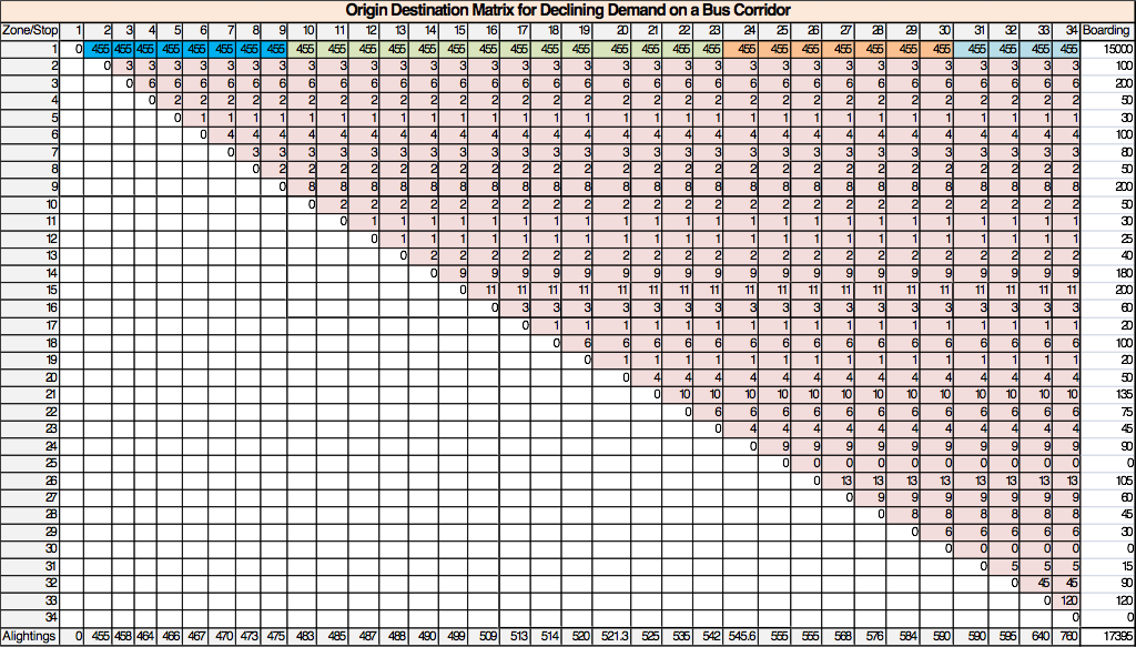
This yields the following boarding, alighting, and load pattern on the original service. This example is taken from the real case of the Santo Amaro—Nove de Julho corridor, project implemented in 1986 in São Paulo.
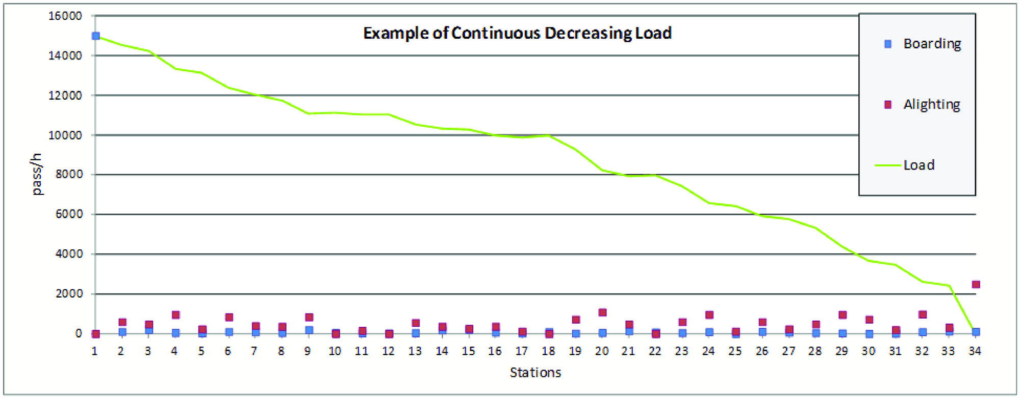
In this example there are 15,000 customers boarding at the first station, a transfer terminal, and just 2,395 customers boarding at the remaining 33 stations. In this situation, a service plan similar to the one shown in Figure 6.68 turns out to be optimal.
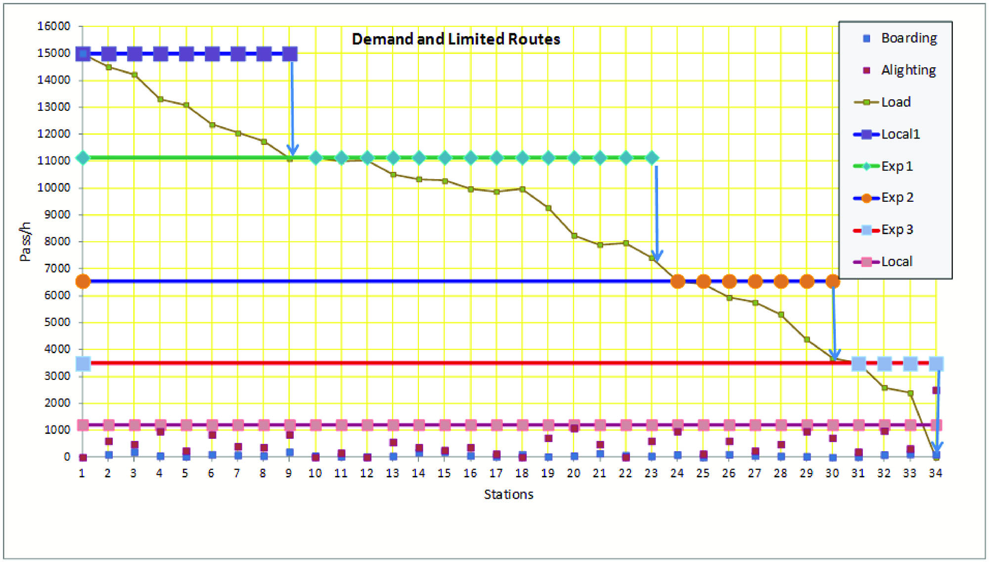
Each route serves a specific stretch of the corridor. The route goes express from the terminal (or CBD) to the beginning of the stretch it services, then it makes all the stops in its service area, and then returns (usually express) to the terminal. The return is express, because the demand in the opposite direction is generally much lower.
The big difference between this scenario and earlier scenarios is that, as the express routes do not reach the end of the corridor, there is a significant reduction in total cycle time (TC) and consequently a sizable fleet reduction. Each express service is designed to meet the direct demand from the terminal (or CBD) to a specific service zone.
Table 6.50Boarding, Alighting, and Load per Designed Service on Declining Demand Example Corridor
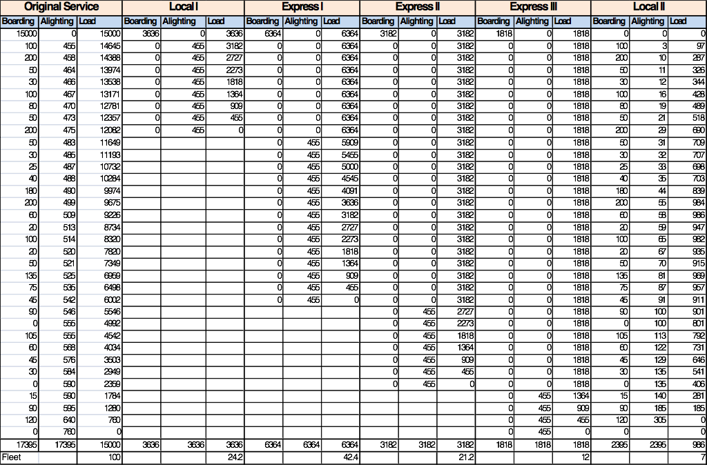
One local service can attend to all the trips not destined for the terminal (2,395 passengers per hour that board and alight along the corridor). This service has a maximum load of around 986 passengers per hour.
In this case, the benefits to passengers of the new services are as shown in Table 6.51 and the benefits to operations of the new services are as shown in Table 6.52.
Table 6.51Benefits of New Services to Passengers
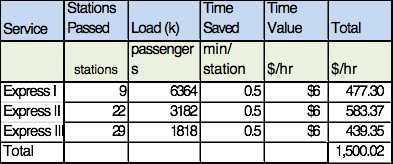
Table 6.52Benefits of New Services to Operations
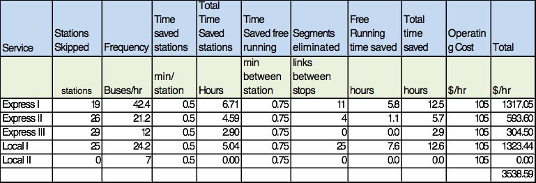
In this case, because of the early return of some of the vehicles, there are savings in running time for vehicles, not only from the removal of stations. To include this benefit, the operational time savings for not running till the end of the corridor are also calculated.
Benefits add operational savings (US$3,538) and passenger savings (US$1,500) to the total of US$5,038.
Table 6.53Costs
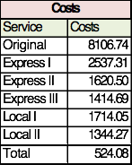
Following the formula for calculating the costs of implementing the new express routes (the net balance of wait cost per route), the additional cost is US$524, as summarized in Table 6.53. Resulting in a net benefit of (US$5,038–US$524) US$4,515. In this example, the fact that many services allowed early return led to a dramatic reduction in operating costs, as buses were able to reduce their cycle times.
6.7.6Shortened Routes
Even within simple BRT systems that only allow for local stations, it is possible to adjust the service to better meet the demand by having some bus routes turn around before reaching the terminal. The same corridor can host several routes of varying lengths. A single corridor may be split into two or more routes covering a different portion of the corridor.
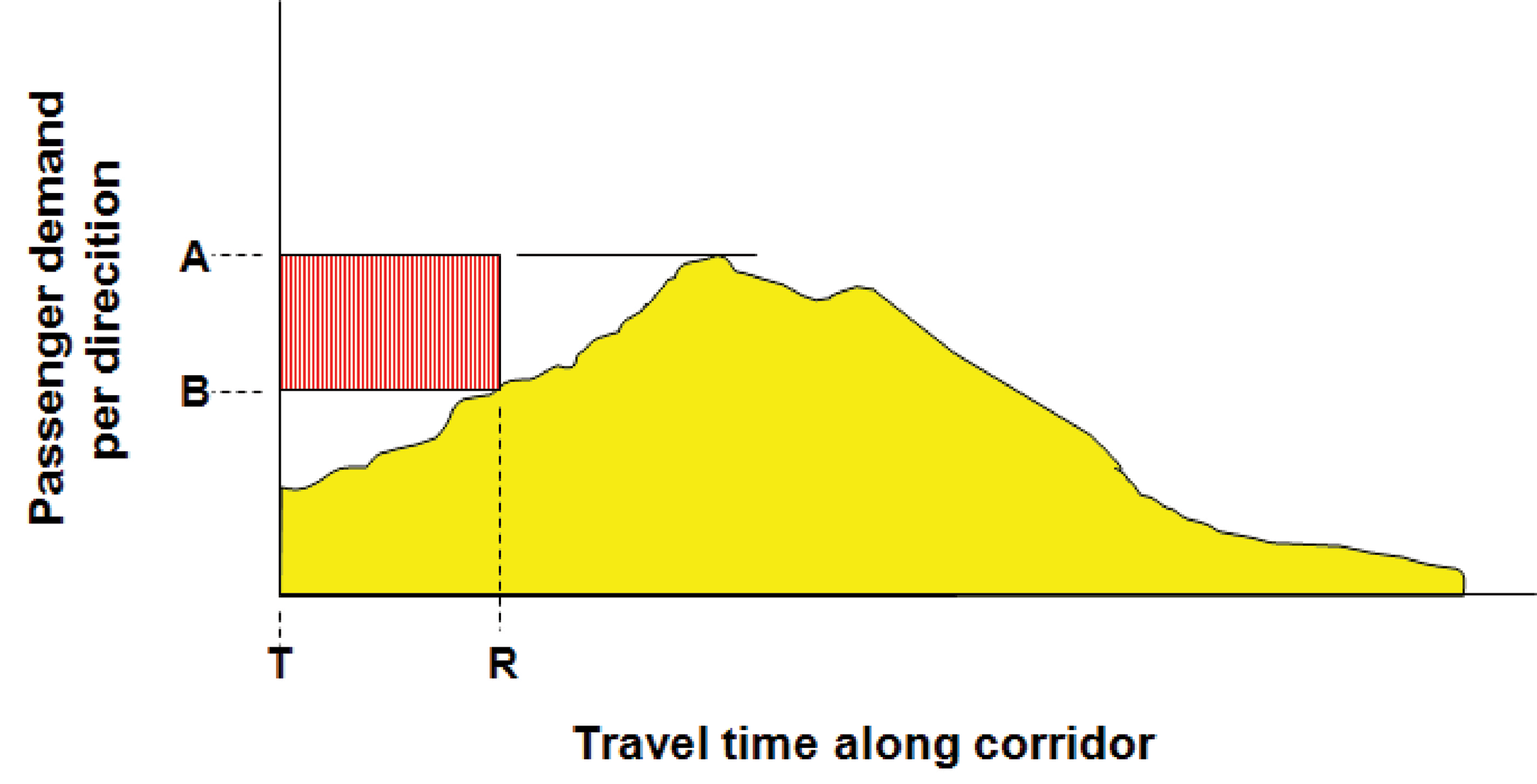
In Figure 6.69, a diagram shows the loads along an existing bus corridor. If the demand on a given part of the corridor is high, a second service can be added that operates only on that part of the route. All customers travelling between any OD pair on the shorter service will be indifferent to the two bus routes, so there is no lost travel time for any customer. There are, however, significant operational cost savings, as in the previous example, and the BRT vehicles operating on the shortened service avoid a large number of stations.
Shortened routes focusing on higher-demand central areas will contribute to high operating efficiencies. These efficiency gains will help reduce the number of vehicles required to serve the corridor.
Looking at Figure 6.69, where most of the corridor’s demand occurs in the central area, if there is only one service operating the entire length of the corridor, all vehicles would depart from point T and operate with low load factors at the beginning and the end of the corridor. However, if vehicles were to operate a shortened route beginning from point R, then the number of vehicles required to serve the corridor will be reduced and the load factor per bus will increase. This fleet reduction is calculated as:
Eq. 6.55
\[ \text{Fleet reduction} = {{2*|R-T| \over V_\text{corridor} } * A - B) \over \text{VSize} * \text{LoadFactor}} \]
Where:
- \( T \): Terminal position;
- \( R \): Early return position;
- \( V_\text{corridor} \): Corridor commercial speed;
- \( |R-T| \): Distance between early return position and terminal;
- \( |R-T|/V_\text{corridor} \): Travel time between early return position and terminal;
- \( A \): Maximum Demand on the Critical Link (MaxLoad);
- \( B \): Load on point $.
Example:
\( A = 15,000 \text{passengers/hour} \);
\( B = 10,000 \text{passengers/hour} \);
\( V = 25 \text{km/hour} \);
\( T = 0 \);
\( R = 5 \text{km}\);
\( {(R-T)/V} = 12\text{minutes(uni-directional time)} = (5/25) \text{hours} \);
\( \text{VSize} * \text{LoadFactor} = 150 pax/bus (vehicle capacity) \).
\[ \text{Fleet reduction}= {2* {|5-0| /over 25} * 15,000 – 10,000 \over 150 } =6 \text{vehicles} \]
In this case, as might be typical of a downtown, most of the demand may be headed downtown from two different directions. For instance, in Yichang, China, along the new BRT corridor, bus routes previously operated all the way through the CBD from north to south and south to north.
In this situation, the vehicles frequently run with low occupancy on either end. Severing one long route in the middle of the city center would force a transfer on a large number of customers with destinations on the far side of the city center. However, having each route pass through to the far edge of the CBD, overlapping through the highest demand section of the city, avoids the transfer and also allows for a higher frequency of service for all customers operating in the zone where the routes from both sides overlap.
The specific costs and benefits of these general approaches should be tested with the actual OD matrix for each corridor.
These early turn-around services can significantly improve the system’s financial performance, but they must be linked with clear customer information about which vehicle is approaching the station and its destination. Otherwise, customers can become confused and frustrated.
In general, the shortened routes are not terminated at the station with the highest boarding and alighting volumes in the system. These stations are already stressed by the quantity of customers and the intensity of customer movements. Further, since these stations tend to be located in the densest portion of the urban area, there are fewer opportunities to efficiently turn the vehicles around. Normally these shortened services terminate just beyond such high-volume stations.
This type of service programming will typically reduce overall operational costs by as much as 10 percent. In order to accommodate a shortened route option, the planning process should provide sufficient flexibility with regard to:
- Providing places where vehicles can make U-turns within the BRT system;
- Designing the station areas with sufficient extra capacity to allow for service adjustments.