11.3Concept and Research
Business has only two functions—marketing and innovation.Peter Drucker, writer and consultant, 1909-2005
Customer research is an important part of the process, and it should be aligned with the public participation process discussed in Chapter 9: Strategic Planning for Communications and Chapter 10: Public Participation. As with the design process, there are many different methodologies as to how and when market research should be used. Perhaps the most important thing to bear in mind is that research should be used to inform the design process—not dictate it. The makeup of this working group usually involves someone from the client side, marketing, and operations. Where there is no in-house expertise, the professional advisers are sometimes advertising and PR agencies or design and branding consultancies.
This process will generate a long list of potential ideas. These should be reduced to three to five “contenders.” These contenders are then used as the basis for the initial design concepts that explore logos, colors, and typography and sample applications of these. These concepts are then tested on focus groups representative of the target markets. From these groups, a consensus should emerge as to what is the most preferable direction for further development.
An early understanding and identification of who to involve in the branding process is key. Chapter 9: Strategic Planning for Communications takes a detailed look at stakeholder identification, but the following groupings are typical:
- Politicians;
- Planners;
- Transport user groups;
- Disability groups;
- Civil societies;
- Chambers of commerce;
- Customers, that is, women, men, parents and children, mobility impaired, car users, students, commuters;
- Planning and development authorities (where there are environmental and infrastructure considerations).
With these thoughts in mind, we can look at the brand’s building blocks in more detail.
11.3.1Naming
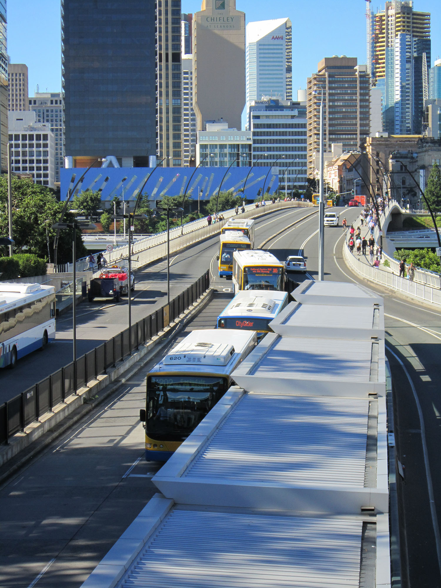
In the case of BRT, some systems, such as TransMilenio, have moved away from the conventional bus mode, dispensing with the word bus altogether. However, some, such as Brisbane, Australia, and its “busway” have demonstrated that it is possible to have a well-executed generic solution.
The word bus is, after all, part of the lingua franca of transportation along with other words such as trans, express, metro, line, and so on. Coupling these words with a place can turn the generic into the local. This is particularly pertinent to systems that expect high numbers of foreign visitors.
There are many different categories from which a brand name can be derived, but they tend to fall into one of five categories and can be generic, local, or abstract. This is best demonstrated by using airlines as examples:
- Descriptive: British Airways (the airline of the United Kingdom);
- Abbreviated: Pan Am (short for Pan American);
- Initials or acronym: Qantas (Queensland and Northern Territory Aerial Services);
- A made-up name: Allegiant (a low-cost, US-based carrier);
- An analogy: Garuda (mighty Garuda is the lord of the birds in Indonesian mythology).
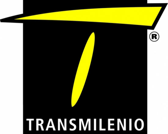
Other acronyms may appear to be less exciting, but it is more important that they be aligned with their context. Curitiba, Brazil, for example, is not Las Vegas, and its Rede Integrada de Transporte (RIT) name should not be discounted because it is not perceived to be a “fun” or “exciting” brand. The high design standards and quality of the Curitiba system tell people much more than the name ever will. If the service delivers what people want, creative and adventurous advertising campaigns can be built around the brand to communicate with different target markets across multimedia platforms. RIT works because the name RIT is associated with an excellently conceived and executed system, and so in many ways the name has less importance attached to it.
The greatest name in the world will quickly become tarnished and ridiculed if the service it represents is poor or promises more than can realistically be delivered.
Another good example of an abbreviated brand name is NWM, Network West Midlands, the public transport brand of Centro, the West Midlands Passenger Transport Executive (PTE) in the United Kingdom. A BRT system is currently being considered for integration into the NWM for the area and an icon will subsequently be developed as a part of the NWM branding.
11.3.2The Logo
The logo is the most recognizable piece of branding. A logo can be a symbol, a word or words known as a logotype, or a combination of both. Logos can be, but do not have to be, literal interpretations or representations of what they represent. Although commercially the majority of logos are abstract, in the public realm it often makes the most sense to stick with the principle of simplicity. Since BRT is a service for the public supported by taxes, rather than an optional product, its symbol should be easy to understand.
Basically, a good logo must be:
- Simple;
- Memorable;
- Timeless;
- Versatile;
- Appropriate.
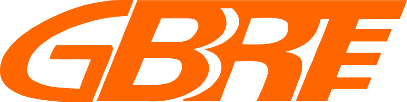
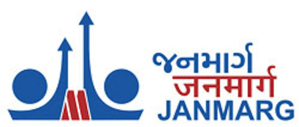
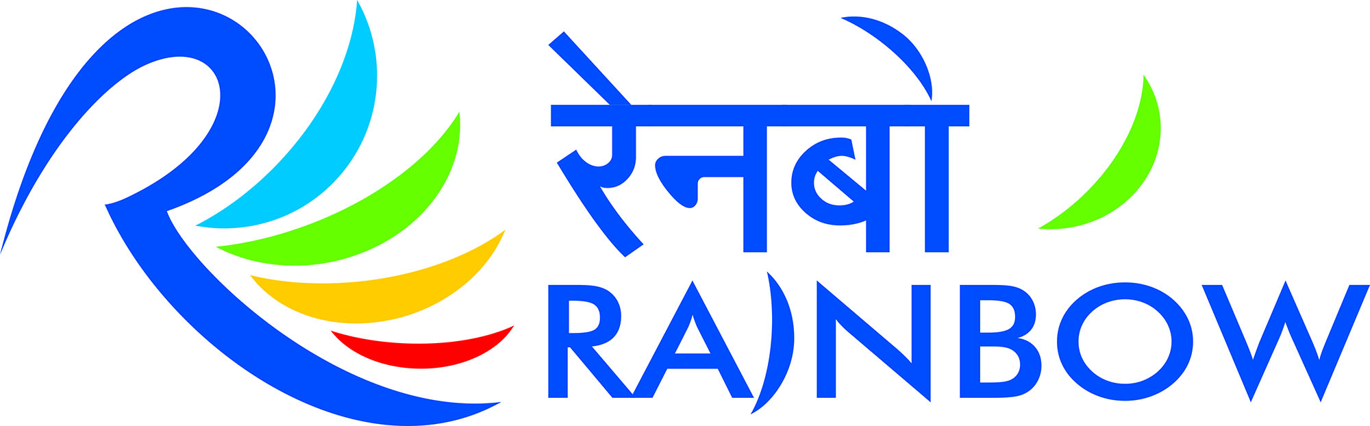
Some of the most recognizable BRT logos are shown in Figures 11.8 through 11.11.
11.3.3Colors and Typography
Although it may seem like a minor decision, advertising research tells us that color influences brand recognition by up to 80 percent; it also tells us that people will make a subconscious judgment within ninety seconds, and the first thing they notice is color. Colors influence public receptiveness to the system as well as reinforce the system’s meaning to the community. There are, however, practical considerations to be taken into account with BRT, such as climate in relation to livery (or uniform insignia), for example. The livery is a vital part of the brand and an important touchstone, so weather conditions and cleaning measures will influence appropriate colors. Therefore, the colors used within the logo and the physical system should be carefully considered for both practical and promotional uses.
Once selected, the color scheme should be applied consistently across different media, understanding that print colors such as Pantone do not always have matching colors in, say, powder coating systems where RAL colors—a standardized set of colors used in Europe—are prevalent, and the colors you see on a computer screen are not the same colors you see in print.
In choosing colors the design team should review literature on color theory (for example, http://www.colorcom.com/research/consumer-color-preferences). The use of color, particularly in branding, is a well-studied science, which has proven that different colors produce different reactions. For example, yellow and orange and some variations of red have been shown to make people hungry, which is why most fast food chains, such as McDonalds and KFC, have chosen colors from this spectrum. As with all elements of branding, however, local context and culture are important, so ensure that any use of color theory is backed up with local expertise.
Given the broad constituency BRT systems need to reach, including different languages and levels of literacy, typography also should be applied with the same principle of simplicity and universal appeal.
Font type, size, color, and background all need to be taken into account. Generally speaking, sans serif and lowercase fonts are more legible, and color contrast is also important. However, this also depends on the local language context.
In some cases, research may show that a hyper-local approach, using the local language primarily, will work best. In others, and increasingly common in world cities, using English in place of, or in addition to, a local language can give the system a more modern and international look and feel.
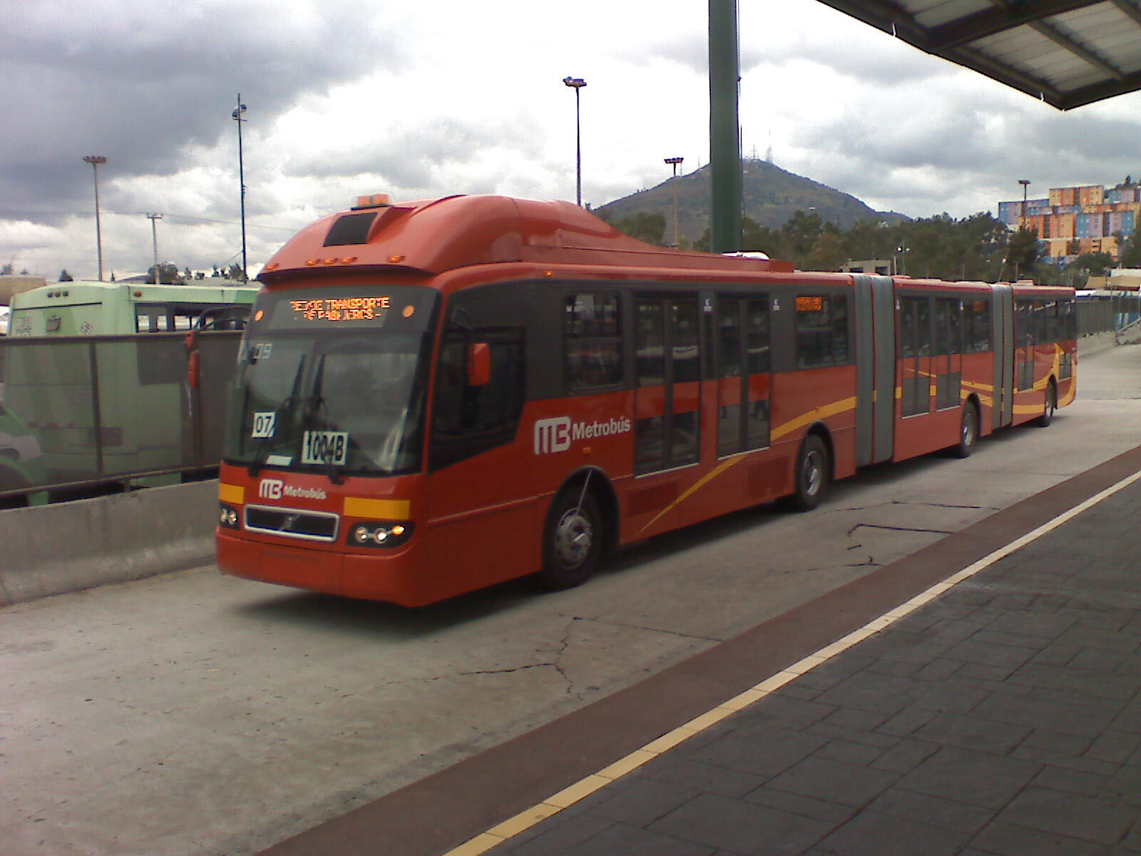
The image (colors, logo, and typography) for Mexico City’s Metrobús is an example of an inclusive and integrating brand. It was important to the city to establish a strong statement of the project, since there was initial social resistance to it, from former operators and public transport users alike. The color red, the simple solid logo, and the clean type supported the idea of an energetic, modern, and efficient mode of transportation. Since the system was competing with microbuses, which were not nearly as attractive, having this strong image helped the city promote Metrobús as a serious, professional product.
11.3.4Core Communications: The Route Map
The most practical and essential element of the overall visual communications package is the route map. As previously discussed, visual renderings and station prototypes of a new system are a standard part of any marketing efforts. Sophisticated renderings of a system can do much to stimulate public enthusiasm for the project. In addition, simulation videos that highlight current problems with the transportation system, followed by a visual portrayal of the future system, can also be an effective marketing tool.
Regardless of the complexity of the route or routes, the route map should strictly adhere to the brand guidelines in terms of presentation, color, and typography.
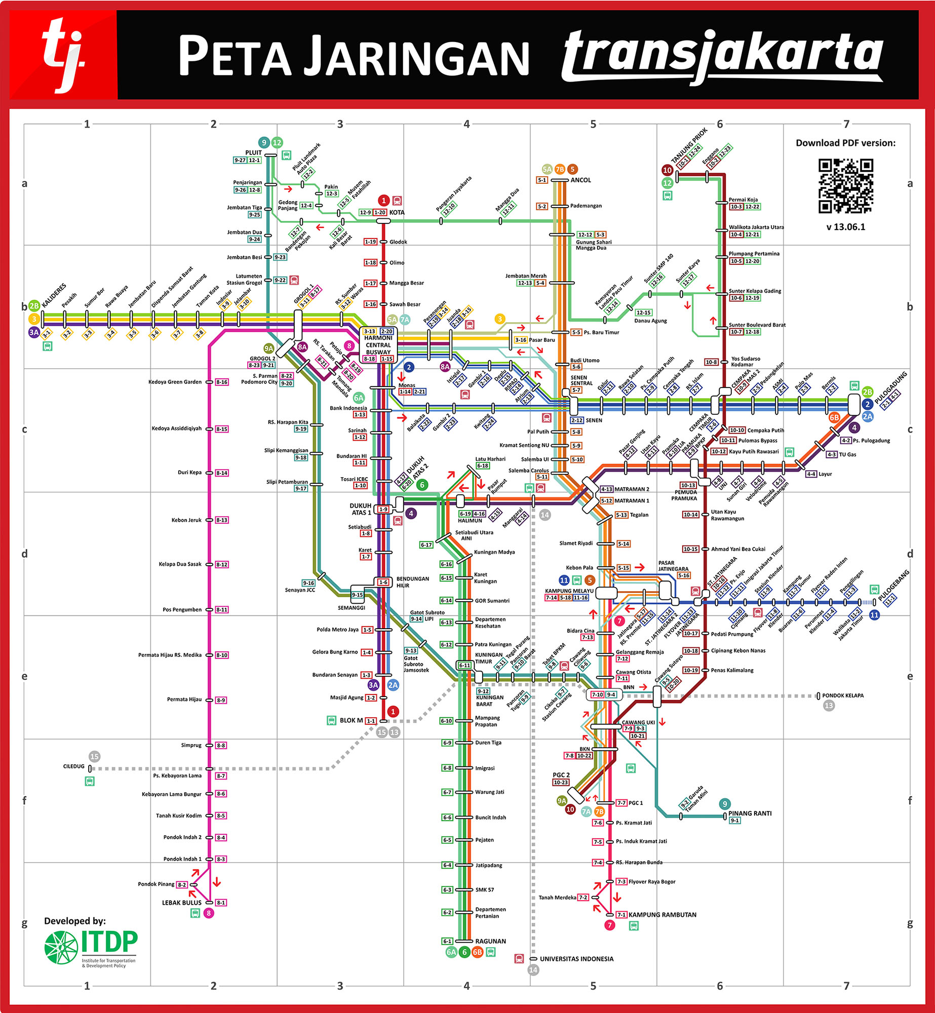
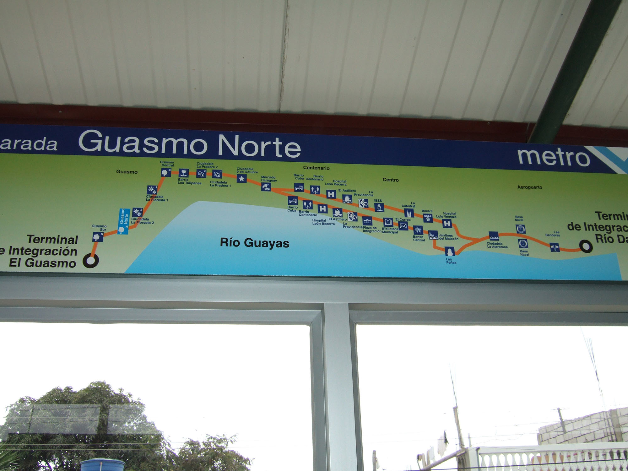
The route map can be a stand-alone piece of collateral and can be assimilated into a network map comprising other modes. In the latter case, it is likely that the visual parameters will be determined by the structure of the network.
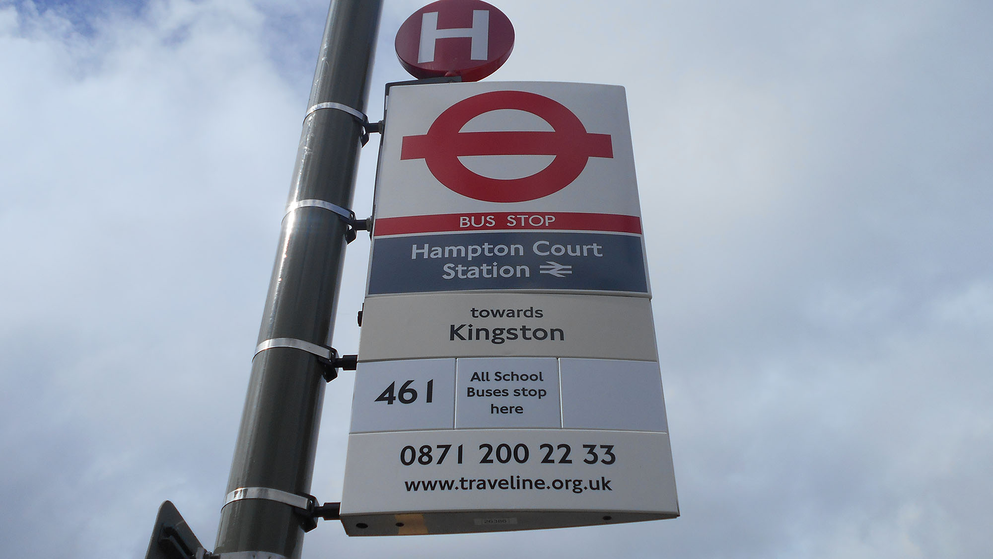
11.3.5Core Communications: Wayfinding
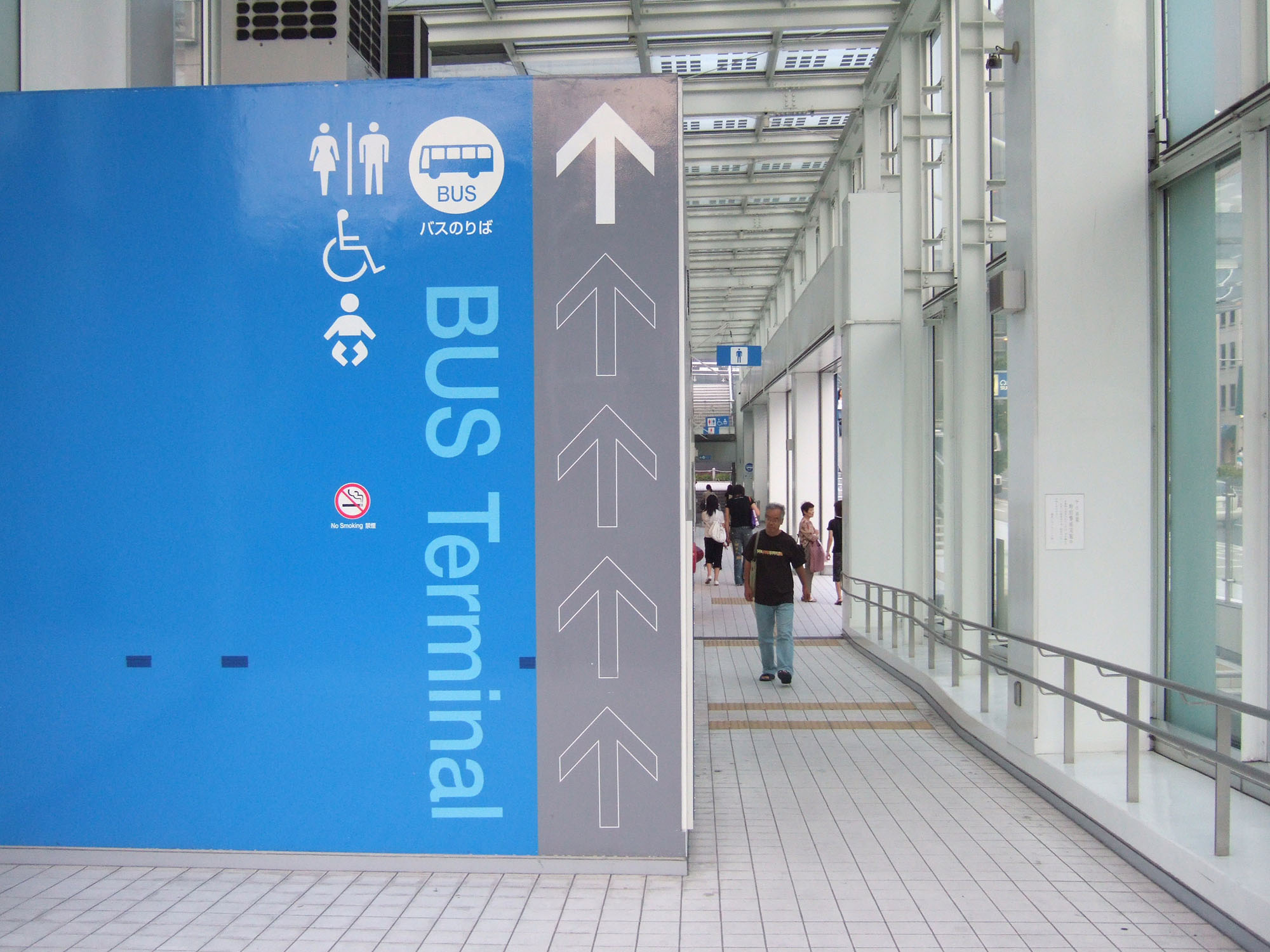
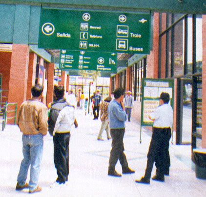
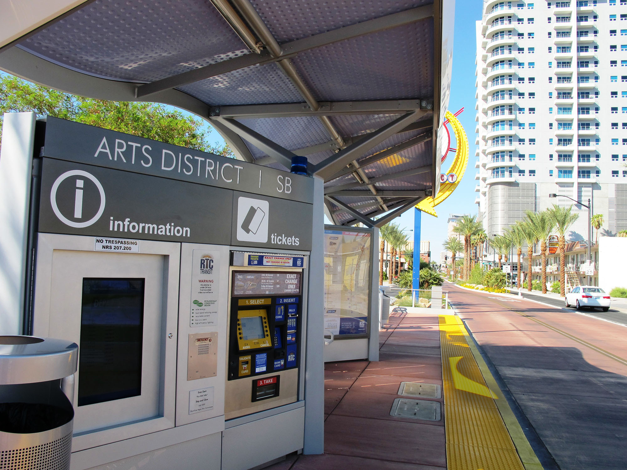
Another key component is signage and wayfinding. Particularly in a dense city center with other transport, good signage can be essential in increasing and keeping your ridership high. This is particularly important for visitors, who, depending on your fare structure, may pay more to ride the BRT than do local residents.
TFL’s four design rules for their interchanges offer guidance for other systems and are good governing principles for all user-information systems:
- Efficiency: Place user information at decision points where pedestrians can easily read it without obstructing the movement of others;
- Usability: The design and placement of signage, maps, kiosks, and ticket machines should make the public transport system easy to use for all customers, including people with limited mobility. Information should be illuminated at night;
- Understanding: Facilitate navigation and movement by designing information systems that are intuitive for all users and well placed. Post signage and information where customers need it;
- Quality: Use high-quality and well-designed materials to help improve the user experience and enhance a public transport system’s values of modernity, cleanliness, and quality. Wherever possible, use vandal-proof material.
11.3.6Core Communications: Livery

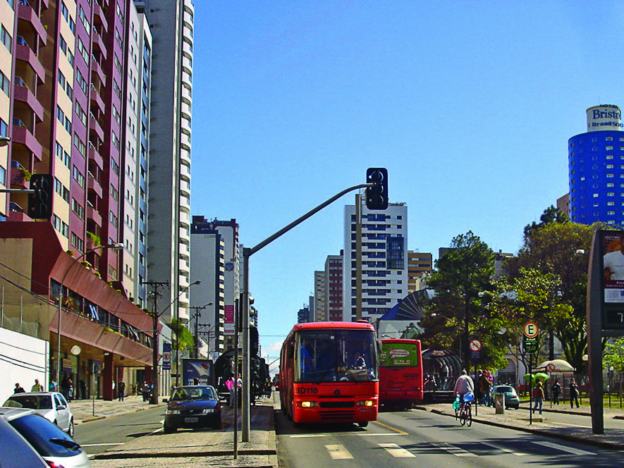
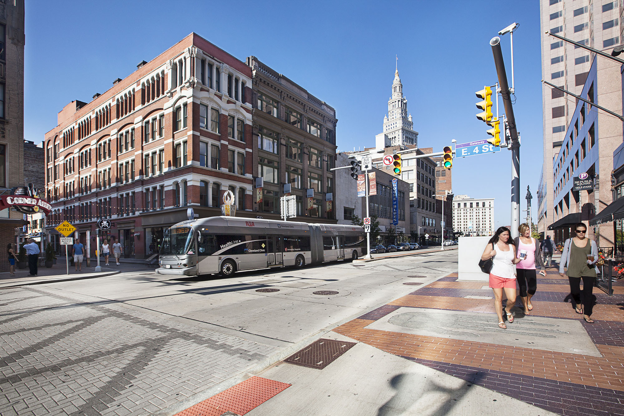
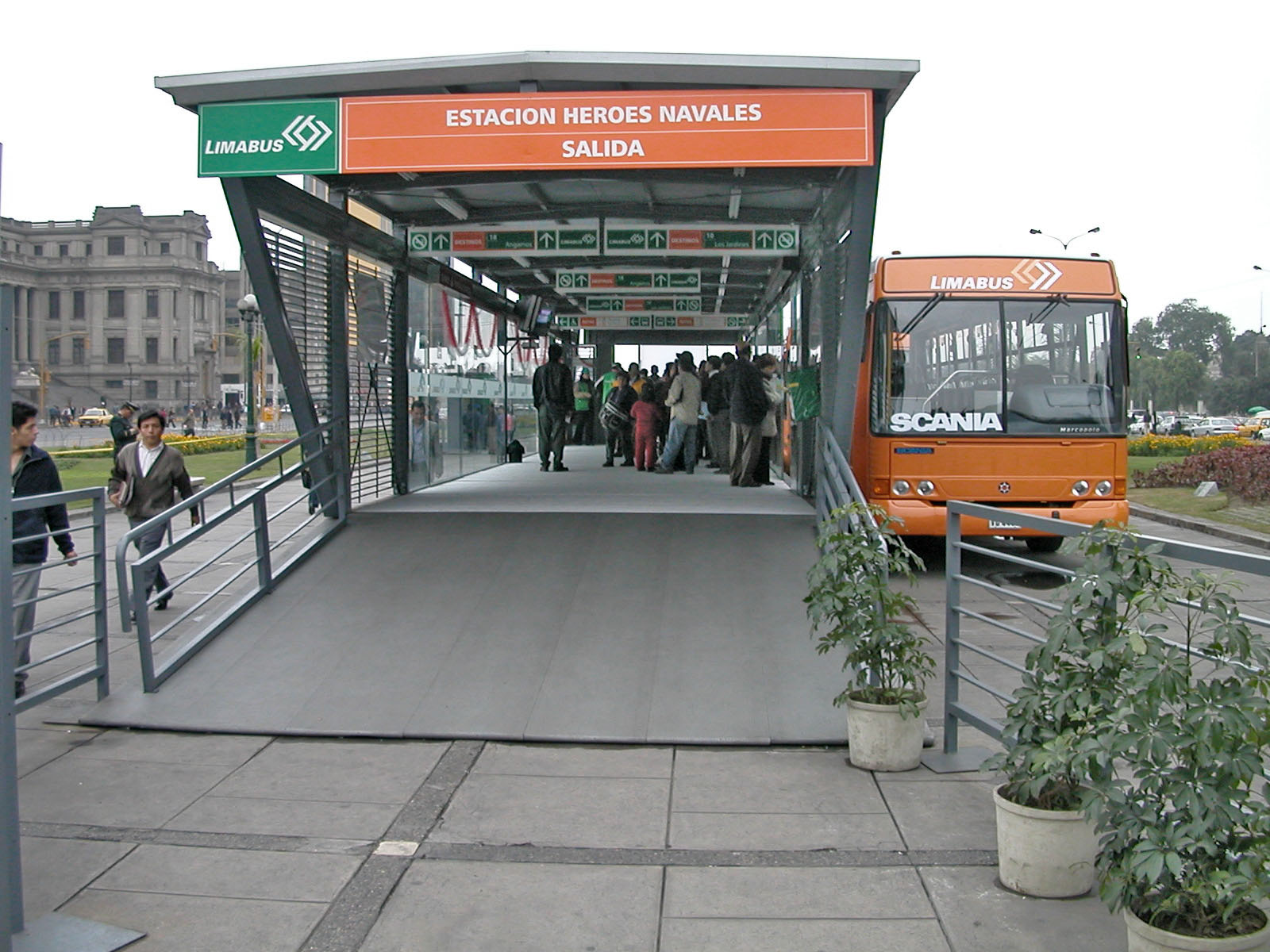
Livery is an integral part of the brand architecture and one of its most visible manifestations. It is the common design scheme or identity a company uses on its vehicles and uniforms. Livery is more than simply how the vehicle is wrapped or painted, it is also the interior design, the driver’s uniform, and it can appear on many other branded pieces. Liveries should be used to convey the overriding brand values of the BRT system. For example, the main attribute might be speed, safety, local, premium, or generic, depending on the needs and expectations of the local context.
There are a number of factors to consider when designing a livery, such as consistency with the branding, vehicle design, climate, and advertising. The livery should, whenever possible, follow the brand color and carry the logo and any tagline. Where vehicles can be dedicated to a particular route, the inclusion of a visible route map or list of key destinations can be a powerful way of promoting the service.
Often a color-coding system is used to brand and differentiate routes or “lines.” While this is helpful to the customer, there is a trade-off; it may limit the flexibility of both the public and contracted fleets to operate on different lines as needed.
Climate and weather can also play an important part in the livery design. In a hot and dusty environment, the vehicles may quickly become discolored. This is obviously unavoidable, but if it is the prevalent condition then a distinctive livery can mitigate the effect (as can a routine cleaning and maintenance program).
The vehicle and its design will dictate the livery parameters to a large extent. Today’s vehicles have large areas of glass all around, usually with solar control that darkens the overall appearance of the vehicle. Many vehicles are now using perforated vinyl that allows advertising and branding over windows, but this limits visibility, and safety issues should be well reviewed.
In other transport modes, accessibility is highly regulated in terms of livery, particularly around the visibility of doors. Designers often like to have minimal visual interruption to their liveries. However, greater accessibility is a goal that all operators must aspire to and the challenge is to create a design that works for everyone.
Advertising can be a source of much-needed revenue for BRT systems, but careful consideration must be given to the amount of advertising a vehicle can reasonably handle. The more of the services “real estate” that is given over to someone else’s brand, the more it undermines your own. If advertising is a critical part of the business plan, it is advisable to look for products or organizations that align with the system’s own brand values. Some transport systems, such as the MTA New York City Transit, offer discounts to advertisers whose ads are transport-themed and adhere to MTA branding guidelines.
Uniforms
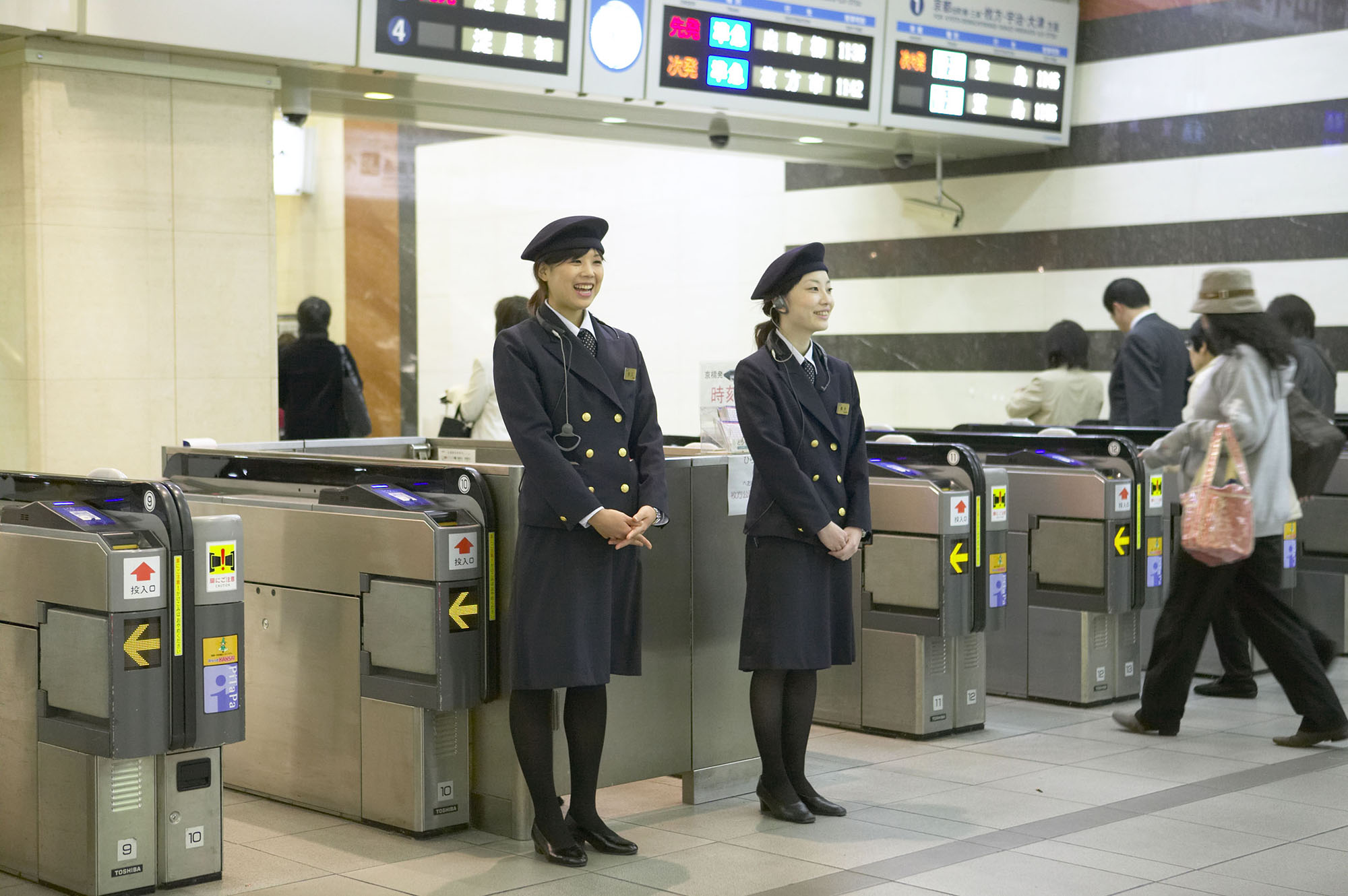
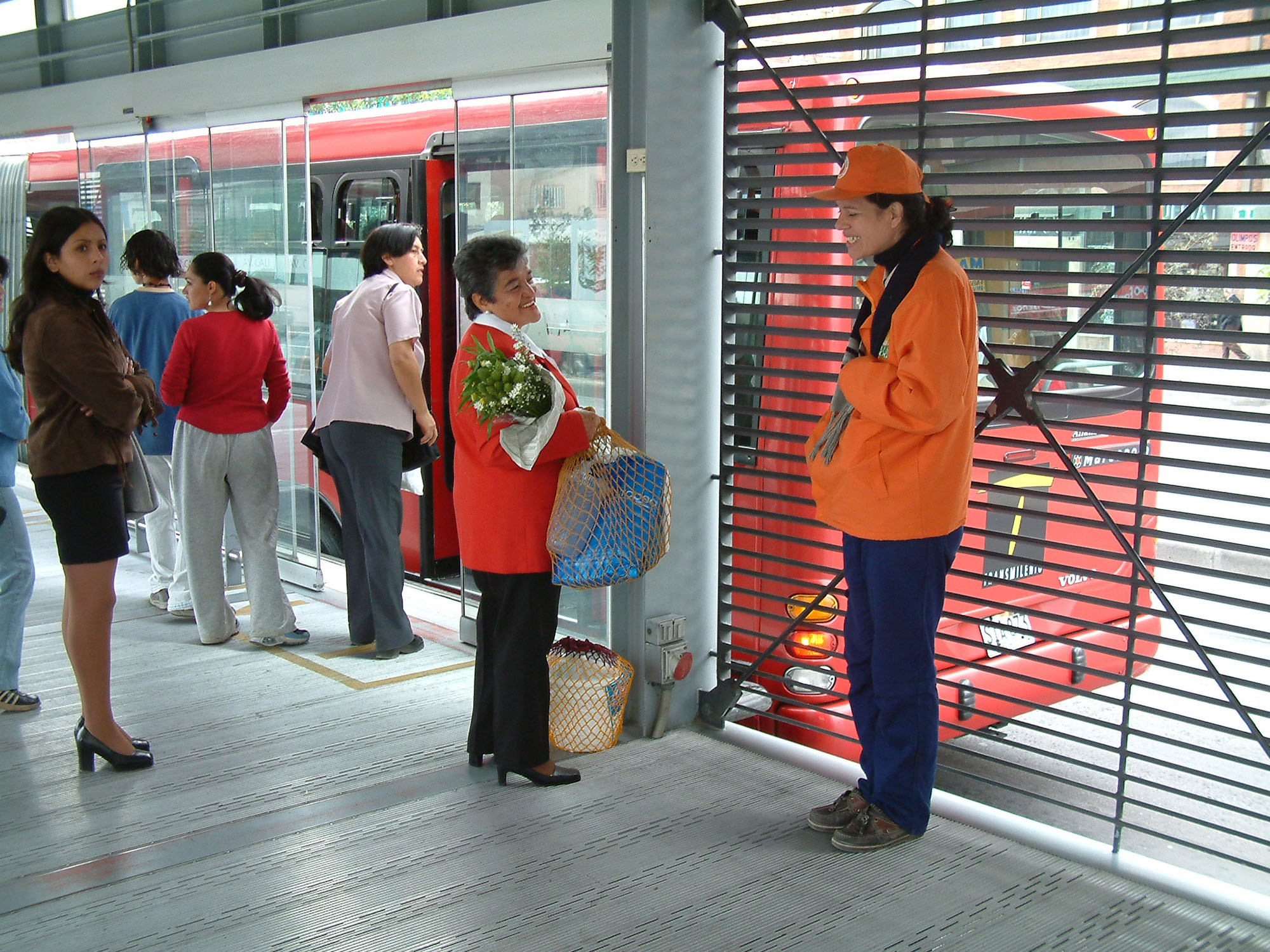
Uniforms, a component of livery, are an important part of the brand and communicate a great deal to your customers and potential customers about the people and the business behind the service. While the uniform is an effective advertisement for the BRT and helps build the brand, it also enables employees to feel part of a unified, professional team.
As with all elements that combine to make a brand identity, uniform design should take into account the following questions:
- How will the uniforms reflect the personality and values of the brand?
- Should the uniforms reflect local or national traditional forms of dress or should the forms be purely “international”?
- What are the climactic working conditions for the range of jobs and activities, including those who spend more time outside than in, vice versa, or both? What fabrics make sense?
- What is the age range of the staff across gender?
- What are the trade union requirements?
Compare a polo shirt to a “military” style shirt. If an airplane pilot turned up in a baseball cap and polo shirt, one might question the seriousness and professionalism of the airline. A bus driver is just as responsible for safety as a pilot; but a BRT system may want to convey a friendlier face, as the driver is generally more accessible to customers than is a pilot. Station attendants or customer service representatives, likewise, may want a casual look that will make them more easily approachable, especially since their jobs require more freedom of movement.
Cultural and social conditions will also influence what makes for the most appropriate uniforms for your particular service. For example, in an urban service, security may be an overriding issue so it may be appropriate to feature military styling to convey a sense of authority. In a relaxed, leisure-oriented location, a more casual uniform might be more effective branding.
11.3.7Copyright
Trademarks and copyrights should protect the new system’s image, brand name, logo, and tagline, as they will be important assets for the system. The copyright should be held by the public authority and not by any of the related private sector firms, such as the vehicle operating companies or the marketing firms.
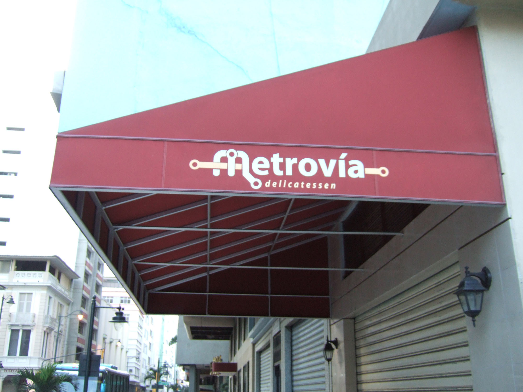
A successful system will likely generate some imitation. For example, various businesses in Bogotá have adapted the name of TransMilenio in order to cash in on the system’s success. Within a week of opening the Metrovía system in Guayaquil, Ecuador, businesses started expropriating the system name. As is often said, imitation is a form of flattery, and this is particularly the case for a city service.
Others will only try to expropriate the system’s name if the name is perceived to have substantial value. To some extent, small-time borrowing of the system name should not be a significant concern, and in fact, can aid in marketing the system. However, if an outside firm is making a significant gain from the use of the name or image, or if the outside usage of the name or image could lead to a degradation of the system’s public image, then legal action should be considered on a case-by-case basis.
Illegal borrowing of the name or image can be a particular concern with merchandising. As noted in Chapter 17: Financing, merchandising T-shirts, toy vehicles, and other items with the system name and logo can be a modest source of system revenue. If private companies take the lead in doing this type of merchandising, then the system forfeits revenue. In Bogotá, at first, street vendors sold many TransMilenio toy vehicles until TransMilenio itself took action to intercede and finally begin merchandising efforts itself.
Joint marketing efforts with corporate or other organizational partnerships can be an effective way to broaden the reach of the system’s message. For example, the favorable response to the TransMilenio system and its positive image among the general public attracted a lot of requests for sponsorship and co-marketing from the business community. A prestigious bank, for instance, offered a generous advertising budget to promote the system in exchange for permission to display its support for landmark ventures like TransMilenio in its official logo.